Apple doesn’t need to reinvent the iPhone every year to change how it feels. Sometimes, a single design decision is enough to reframe the entire product. With the iPhone 17 Pro, Apple appears to be standing at one of those moments again — and the possibility of a black finish arriving later in the cycle could be far more meaningful than it looks at first glance.
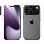
The iPhone 17 Pro design already signals a departure from recent generations. Thicker lines, a tougher silhouette, and a more functional aesthetic suggest a philosophy closer to the Apple Watch Ultra than to the polished, jewel-like iPhones of the past decade. This isn’t just about style. It’s about space, durability, and intention.
A New Design Language Finally Used for Function
The Apple Watch Ultra didn’t just look different — it justified that difference. The larger case enabled a bigger battery, additional sensors, improved cooling, and physical controls designed for real-world use. The design followed function, not the other way around.
The iPhone 17 Pro appears to follow that same logic. A reshaped body creates internal breathing room: more battery capacity, improved thermal management, and the potential for additional specs. These are not cosmetic gains. They directly affect daily use, endurance, and long-term reliability.
In that context, color matters more than usual. A darker, matte black finish would visually reinforce this new identity. Black doesn’t try to be playful. It communicates seriousness, purpose, and confidence. On a device that already leans toward a tougher aesthetic, black would complete the message for professional applications.

The Late-Cycle Color
Apple has a long history of reintroducing excitement through color, often months after launch. Purple iPhones, spring-themed finishes, and the recent Apple Watch Ultra Black are examples of how a color alone can reset attention without altering hardware.
This strategy is efficient, deliberate, and remarkably effective. A new color refreshes the narrative, dominates headlines, and reignites demand — all without touching the supply chain in any meaningful way. It’s a low-cost, high-impact move that Apple can deploy whenever momentum starts to cool.
A black iPhone 17 Pro would fit this pattern perfectly. Same internals. Same performance. A new visual identity that feels heavier, more professional, and more aligned with the “tool” philosophy Apple has been exploring lately.
Changing the Perception
Black has always held a special place in Apple’s design history. From the original iPhone to professional Macs, black finishes have often been reserved for moments when Apple wants to signal authority rather than novelty.
On the iPhone 17 Pro, black would amplify the parallels with the Apple Watch Ultra. It would suggest endurance over elegance, capability over decoration. For professionals, creators, and enthusiasts, that matters. Devices aren’t just objects anymore — they’re extensions of how people work, move, and live.
A black finish also ages better visually. Less distracting and the device feels more usable, durable. That alone can change how people interact with their phone daily.

Reading Apple’s Intentions
Nothing in Apple’s recent moves suggests hesitation about leaning into this direction. The company has shown it’s comfortable breaking long-standing design patterns when there’s a functional reason to do so. The success of the Apple Watch Ultra proved there’s a strong audience for devices that prioritize capability and presence over minimalism.
If the iPhone 17 Pro is the first step toward a more utilitarian Pro identity, a black finish would be the natural extension — not an experiment, but a confirmation. If history is any guide, Cupertino knows exactly when to use it.
The iPhone 17 Pro Black wouldn’t just be another color. It would be a signal that this new design language is here to stay and keep evolving — and that Apple is comfortable letting function, not fashion, lead the conversation.