
Apple’s Liquid Glass design language is expected to remain intact in iOS 27, signaling continuity rather than reinvention. After a major visual shift introduced in iOS 26, the next iteration appears to focus on refinement — subtle adjustments, possible new customization controls, and deeper system polish.
Reports indicate that internal builds of iOS 27 and macOS 27 do not reveal sweeping changes to the Liquid Glass aesthetic. Instead, Apple is reportedly taking a long-term approach, treating the design framework as a foundation that will evolve gradually across several software cycles.

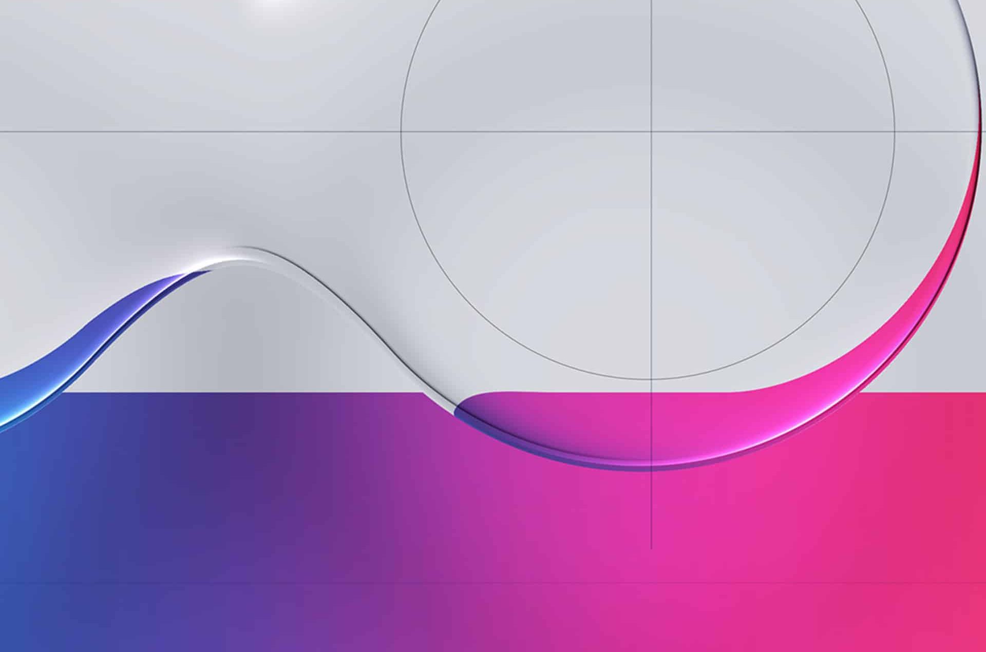
iOS 27: A Design Meant to Mature
Liquid Glass did not emerge overnight. Extending the effect beyond the lock screen clock reportedly required significant engineering work. The goal was to integrate depth, translucency, and layered interaction into systemwide elements without sacrificing clarity or performance.
The transition from concept to full system integration took time. Engineering teams had to balance visual ambition with responsiveness and battery efficiency. That process shaped how Liquid Glass ultimately appeared in iOS 26.
Since then, Apple has added incremental customization options. iOS 26.1 introduced the “Tinted” appearance setting. Later, iOS 26.4 allowed users to disable highlight effects, offering more visual control. At one stage, a broader systemwide slider was reportedly explored internally.
iOS 27 appears poised to continue that measured path.
Customization Over Reinvention
Rather than replacing Liquid Glass, Apple may expand how users interact with it. Reports suggest that one additional customization layer could arrive in iOS 27, potentially building on the optional controls introduced in recent point releases.
This approach reflects a broader pattern in Apple’s software strategy. Major visual overhauls tend to be followed by several years of iteration. Instead of revisiting the entire interface, Apple typically fine-tunes behavior, responsiveness, and accessibility.
Observers familiar with internal development have suggested that iOS 27 will prioritize performance and stability. That emphasis aligns with Apple’s historical cadence: after a design shift, consolidation follows.
Leadership and Design Direction
The evolution of Liquid Glass also intersects with leadership changes within Apple’s design organization. Alan Dye, who had been closely associated with software design direction, departed last year. Steve Lemay stepped into the role, overseeing ongoing interface development.
Transitions in leadership do not necessarily signal aesthetic change, but they often influence how aggressively a design language is pushed forward. In this case, the continuity seen in early iOS 27 builds suggests steady progression rather than abrupt stylistic shifts.
Performance as a Priority
iOS 27 is widely expected to focus on under-the-hood optimization. After a visually expressive cycle, Apple typically invests in refining system performance, smoothing animations, and tightening memory management.
Liquid Glass relies on real-time rendering effects, including blur layers and transparency. Ensuring these elements operate fluidly across devices — from standard models to Pro variants — requires continued engineering attention.
Maintaining visual sophistication without compromising battery life or responsiveness becomes central in this phase.
macOS 27 Parallels
Liquid Glass is not exclusive to iPhone. macOS adopted similar layered visual elements, bringing cohesion across Apple’s platforms. Internal reports suggest macOS 27 will also avoid large-scale design disruption.
This cross-platform consistency reinforces Apple’s long-term interface direction. Instead of platform-specific experimentation, the company appears to be standardizing visual language across devices.

Years, Not Months
Design history at Apple often unfolds over multiple generations. iOS 7’s radical shift was followed by years of gradual refinement. The same pattern appears likely for Liquid Glass.
Speculation that Apple might abandon or dramatically alter the aesthetic in iOS 27 seems inconsistent with the company’s typical software roadmap. The emphasis appears to be on continuity, incremental control, and stability.
Users upgrading to iOS 27 should not expect the interface to look unfamiliar. The broader structure remains recognizable, with refinements layered into existing elements.
If an additional customization option appears, it will likely complement — not replace — the current system.
Liquid Glass, introduced as a defining visual language, seems positioned to remain a central component of Apple’s interface evolution across iOS 27 and beyond.


