
Apple has long been the benchmark for human-friendly software, where code translates into experiences that feel intuitive and effortless.
To truly understand the evolution of modern software, one must look at the Apple Human Interface as a living, breathing document. Far from being a rigid set of instructions, the HIG is a philosophy that has guided developers since the era of the Apple II and the 1987 Macintosh II. It serves as a bridge between technical functionality and emotional resonance, so a heart-rate check on Apple Watch or a video edit on Mac still feels unmistakably Apple.
The Core Philosophy: Clarity, Deference, and Depth
At the heart of the Apple HIG lie three primary themes that dictate every pixel and interaction. These are psychological principles designed to reduce cognitive load.
1. Clarity
System-wide, the interface must be legible and easy to navigate. Clarity means that text is readable at any size, icons are precise and lucid, and adornments are kept to a minimum. The focus is on functionality. Every element is designed to convey meaning — if a button doesn’t look like a button, it has failed the clarity test.
2. Deference
The interface should never compete with the content. Deference keeps the interface in the background, so the user’s photos, messages, or work stay front and center. Subtle motion and clear layering help people understand what matters, without extra decoration getting in the way.
3. Depth
Visual layers and realistic motion impart a sense of depth that helps users understand the relationship between different interface elements. Apple uses layers, shadows, and smooth transitions to build a 3D space right on a flat screen. It makes the whole digital experience feel more physical and grounded, like you’re interacting with real objects instead of just pixels.

The 6 Pillars of the Modern HIG Structure
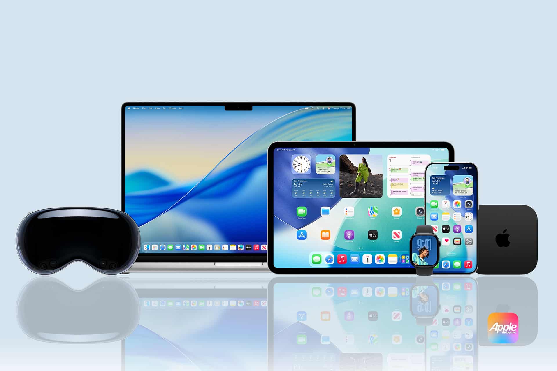
As Apple’s ecosystem expanded across iOS, macOS, watchOS, tvOS, and now visionOS, the HIG evolved into a unified framework. To keep everything feeling like it belongs to the same family, Apple organized the HIG into six main pillars. Think of these as the DNA that makes an app feel like “Apple,” no matter which device you’re holding.
1. Platforms
This pillar provides specific guidance for the unique hardware constraints of each device. It dictates how an app should behave on a high-resolution Mac display versus the glanceable interface of an Apple Watch. With the advent of visionOS, this pillar now includes spatial computing, where the interface interacts with the user’s physical room.
2. Foundations
The Foundations represent the visual and sensory core of any app. Here, Apple outlines the color palette, with an emphasis on strong contrast and semantic colors that automatically adjust for Light and Dark Mode. This section also covers typography, specifically the use of system fonts like San Francisco (SF) and New York. These fonts are built for readability at every size, so text stays clear and sharp. To keep the UI consistent, teams often use design tokens — shared values for things like spacing and color that stay in sync across the whole product.
3. Patterns
Patterns are the “best practice” solutions for recurring design challenges. This includes the flow of onboarding a new user, the layout of a navigation bar, or the behavior of a tab bar. When developers follow these established patterns, they make their apps feel familiar and take the mental heavy lifting off the user.
4. Components
Components are the functional building blocks of the UI. This pillar covers the specific technical requirements for interface elements such as buttons, pickers, sliders, and switches. The HIG provides exact specifications for these elements to ensure they respond predictably to user input and maintain aesthetic integrity.
5. Inputs
The Inputs pillar focuses on how humans interact with their devices. It spans traditional mouse and keyboard interactions for macOS to the complex gestures, haptics, and voice commands used in iOS. In the context of visionOS, this has expanded to include eye-tracking and hand-gesture inputs, requiring a high level of precision and feedback.
6. Technologies
Finally, Technologies cover the integration of system-level features that enhance the user experience. This includes implementing Apple Pay, iCloud synchronization, and Game Center. When developers use these native technologies, they bridge the gap between their app and the rest of the Apple world. It makes everything feel seamless, like the app belongs on the device instead of feeling bolted on or awkward.
Technical Standards: The Mechanics of Perfection
For designers and developers, the HIG sets clear technical standards that protect both the look and the usability of the product.
Typography: SF and New York
Apple uses proprietary font families to maintain brand consistency.
- San Francisco (SF Pro): A sans-serif font designed for legibility and adaptability. It shifts its tracking and letter spacing dynamically based on the font size.
- New York: A serif typeface that brings a sense of tradition and elegance to editorial content.
Accessibility and Inclusivity
Apple believes that technology should be accessible to everyone. The HIG mandates strict adherence to Human-centric design:
- Touch Targets: Keep tap targets at 44 × 44 points or larger so they’re easy to hit.
- Dynamic Type: Support for adjustable text sizes so users can increase legibility system-wide.
- VoiceOver: Giving every interface element a clear, descriptive label for users who rely on screen readers.
Adaptivity and Layout
Apple devices come in every size, from Apple Watch to Pro Display XDR, so the HIG puts a lot of focus on adaptive layouts. With Auto Layout and Size Classes, interfaces can adjust smoothly across screens and orientations, while the visual hierarchy stays clear and consistent.
Why the HIG Matters for Business
Great Apple UX isn’t decoration. It’s how you win and keep users.
- App Store Review Success: Apps that deviate significantly from the HIG often face rejection during the review process. Following the guidelines is the fastest path to deployment.
- Reduced Cognitive Load: When an app uses standard navigation bars and tab bars, users don’t have to “learn” how to use it. This leads to higher retention rates.
- Brand Trust: Users associate the “Apple look” with security and quality. When you use things like Dark Mode, the standard system fonts, and those familiar gestures everyone already knows, your app instantly feels high-quality. It’s like a “shortcut” to winning a user’s trust, because your app looks and acts just like the premium software Apple makes, people automatically treat it with the same respect.
- Lower Support Costs: Intuitive design leads to fewer user errors, which directly translates to fewer support tickets and higher user satisfaction.
The Elements of Interaction: Gestures and Feedback
Apple’s interface is tactile. The HIG defines how gestures — like swiping, pinching, and tapping — should behave.
- Feedback: Every action should have a reaction. Whether it’s a subtle haptic vibration or a visual change in a button’s state, user control is maintained through constant communication between the device and the human.
- Modality: The guidelines explain when to use “modals” (temporary screens) to focus a user’s attention on a specific task without losing their place in the main workflow.
Comparison: Apple HIG vs. Material Design vs. Polaris
To understand Apple’s unique approach, it helps to compare it with other industry leaders.
| Feature | Apple HIG | Google Material Design | Shopify Polaris |
| Primary focus | Human experience & Luxury | Utility & Adaptive grid | E-commerce & Task efficiency |
| Visual style | Translucency & Realism | Bold colors & Paper shadows | Clean, functional, flat |
| Navigation | Bottom tab bar (Primary) | Side drawer / Bottom nav | Sidebar (desktop-centric) |
| Philosophy | Content is King (Deference) | Material as a metaphor | Merchant success |
What’s Next: Beyond the Glass Screen
The introduction of visionOS marks the newest chapter in the HIG. The guidelines have now expanded into the realm of Spatial Computing, where negative space is no longer just a gap on a screen, but a physical distance in a room.
In this new frontier, depth and clarity take on new meanings. Windows have “glass” textures that allow light to pass through, and shadows are cast onto the user’s real-world floor. Even in virtual environments, the HIG keeps the same human-first design principles in place.
Conclusion
The Apple Human Interface Guidelines are more than a manual; they are a testament to the idea that technology should serve humanity, not the other way around. Apple puts a huge focus on onboarding, visual hierarchy, and aesthetic integrity. Because of that, they’ve created a design language that billions of people can “speak” fluently without even thinking about it.
As we move toward a future of augmented reality and AI-driven interfaces, the HIG will continue to serve as the North Star for creators. Solo developer or global enterprise, Apple Human Interface helps your product feel right at home on Apple devices — like it belongs in the user’s everyday flow. When you respect a person’s time, focus, and physical abilities, you build something bigger than just an app. You create an experience that feels like magic.