
The first iPhone was not only a new product. It was a design argument.
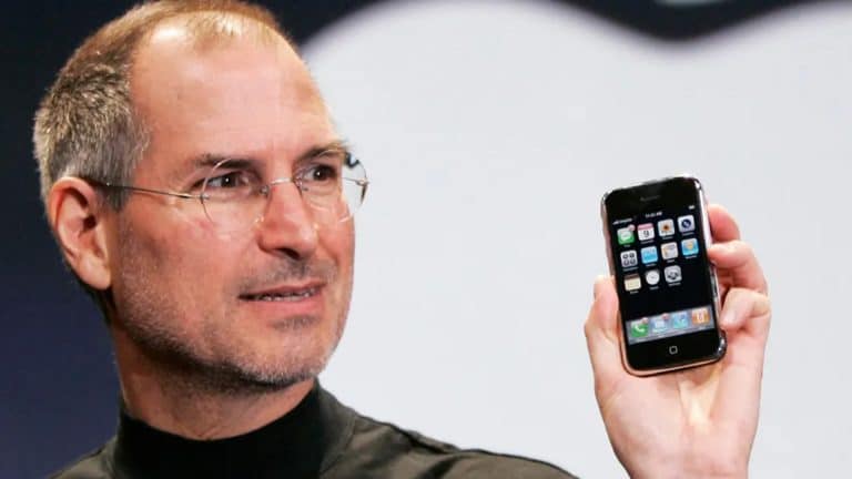
When Steve Jobs introduced iPhone in January 2007, Apple described it as a mobile phone, a widescreen iPod, and an Internet communications device in one small handheld product. But the deeper shift was visual and behavioral. A glass front, rounded corners, a large multi-touch screen, a grid of icons, finger-based gestures, and a simple name turned the smartphone from a crowded button-driven tool into an object people immediately understood.
That design language became one of the most copied visual systems in technology. The smartphone industry was always going to move toward touchscreens, thinner bodies, app icons, and larger displays. But Apple’s later legal battle with Samsung raised a sharper question: where does legitimate competition end and unethical imitation begin?
The Apple-Samsung patent war became the most famous design fight of the smartphone era. It was about patents, damages, and legal standards, but it was also about leadership, taste, speed, and the thin line between studying a rival and rebuilding a product around that rival’s choices.

The First iPhone Set the Template
Apple did not invent every individual idea inside the smartphone. Touchscreens existed. Mobile browsers existed. App icons existed. Rounded rectangles existed. Phones existed. What Apple did was combine hardware, software, services, and industrial design into a product that felt complete.
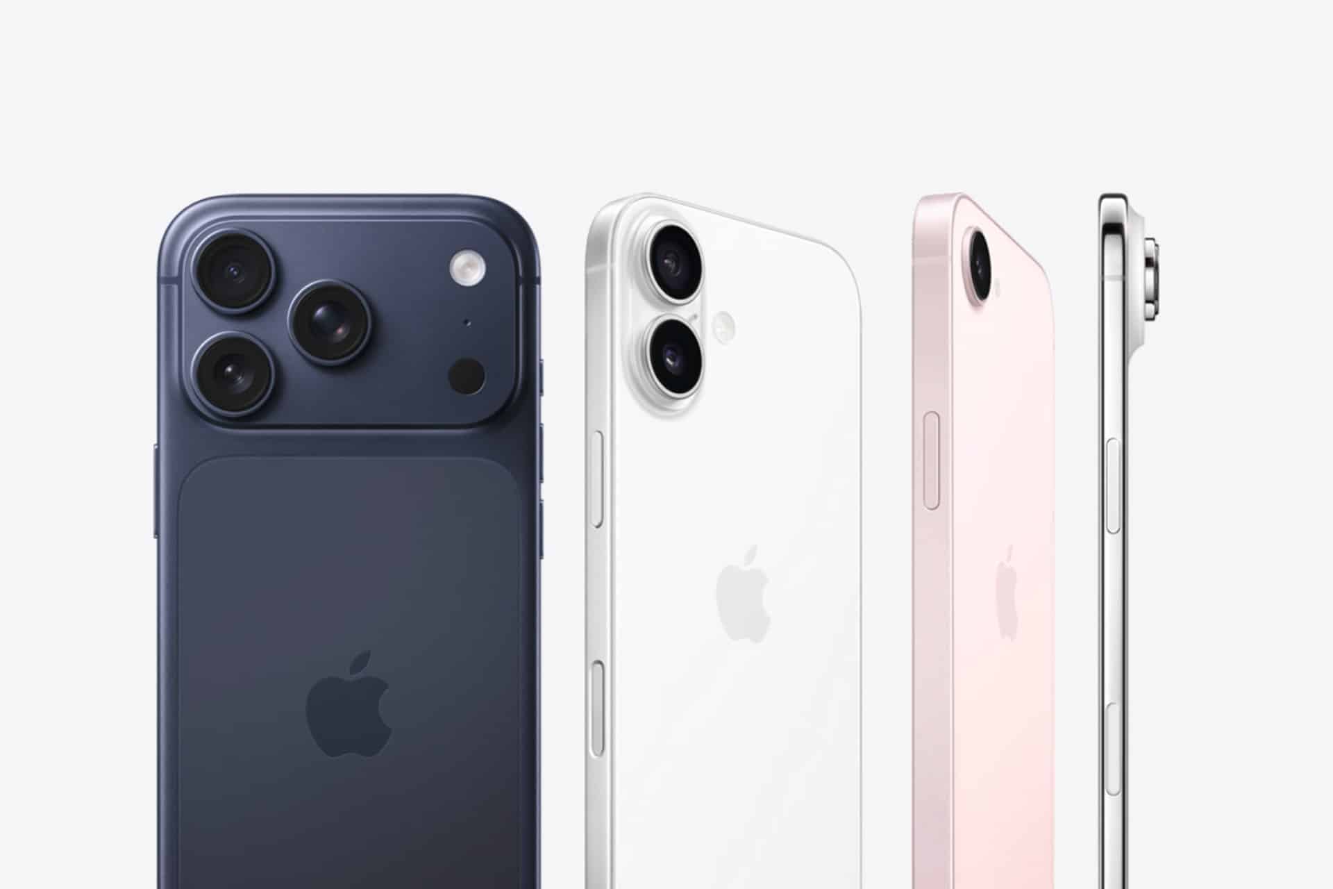
The first iPhone’s design was restrained. It removed most visible controls, centered the screen, used a simple front face, and made the interface feel like the product. The rounded corners, black glass, home button, icon grid, and direct-touch gestures became instantly recognizable.
That matters because design is not only decoration. It is how a product explains itself. Apple’s leadership understood that the iPhone had to look simple before users even touched it. The shape, materials, interface, and naming worked together to make the device feel inevitable.
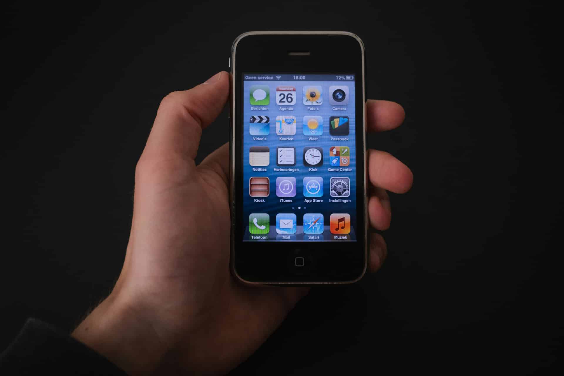
Samsung and other phone makers understood that too. The market changed quickly after the iPhone. Hardware keyboards looked older. Stylus-heavy interfaces felt less direct. Carrier-driven software felt messy. The industry began racing toward larger touchscreens and app-centered design.
Competition was necessary. Copying was the controversy.
When Design Becomes a Legal Fight
Apple sued Samsung in 2011, accusing the company of infringing design and utility patents tied to the iPhone and iPad. The dispute covered a wide range of claims, but the public image of the case came down to visible similarities: rectangular phones with rounded corners, black front faces, icon grids, and touch-driven interfaces.
In 2012, a U.S. jury largely sided with Apple, awarding more than $1 billion in damages before later adjustments and retrials changed the amount. The case continued for years, eventually reaching the U.S. Supreme Court on the question of how damages should be calculated for design patent infringement.
The Supreme Court did not decide that Samsung had not copied Apple. Its 2016 decision focused on damages, ruling that the “article of manufacture” for design patent damages could be less than the entire finished smartphone. That was a major legal issue because Apple had argued for Samsung’s total profits from infringing phones, while Samsung argued damages should be tied only to the copied components.
The companies finally settled the U.S. patent dispute in 2018. The settlement ended years of courtroom battles, but it did not erase the larger design lesson.
The iPhone had become the reference point for the modern smartphone, and Samsung had been legally found to infringe Apple design patents in a fight that reshaped how the industry talked about copying.
Samsung’s Internal Comparisons Became the Symbol
The most damaging part of the case for Samsung’s reputation was not only the phones themselves. It was the internal material shown during the trial.
Apple presented Samsung documents comparing the Galaxy S user experience to the iPhone feature by feature. The 132-page report, translated from Korean, evaluated how Samsung’s phone stacked up against Apple’s and suggested areas where Samsung could make the product more iPhone-like.
That kind of competitive analysis is common in technology companies. Every major hardware maker studies rivals. Every software team compares features. Every design lab examines what works in the market. Reverse-engineering, teardown analysis, interface review, and competitive benchmarking are normal parts of product development.
The ethical problem begins when analysis becomes a roadmap for imitation. Studying why a competitor’s product works is one thing. Recreating its visual language, interaction patterns, packaging feel, icon style, naming rhythm, and retail impression is another.
Apple’s argument was that Samsung crossed that line. Samsung argued its products were different, that Apple’s claims were too broad, and that smartphone design had many functional constraints. The courts did not accept every Apple claim, but the case left Samsung with a lasting perception problem: it looked as if the company had studied the iPhone not only to compete, but to catch up by moving closer to Apple’s design choices.
Rounded Corners Were Never Just Rounded Corners
The Apple-Samsung fight was often mocked as a battle over “rounded rectangles.” That was an easy joke, but it oversimplified the dispute.
Apple was not claiming ownership of every rounded rectangle in existence. The design patents at issue covered specific ornamental designs, including the front face, bezel, and icon layout of certain devices. The legal question was whether Samsung’s products created a substantially similar visual impression to Apple’s protected designs.
Rounded corners mattered because they were part of a complete product impression. The iPhone’s physical shape, black glass front, centered display, minimal buttons, icon grid, and software presentation worked as one visual system. Samsung’s accused devices were judged against that overall appearance, not only one corner radius.
Design patents exist because appearance can carry commercial value. A product can be recognized instantly by shape, proportion, layout, materials, colors, and interface style. Apple built the iPhone around that recognition. Samsung’s problem was that some of its early Galaxy products appeared too close to the visual grammar Apple had made famous.
The law struggled with how to price that copying. The culture understood the accusation more easily: consumers could look at the products and see why Apple was angry.
Names, Icons, Colors, and the Look of Familiarity
Copying in consumer technology is rarely limited to hardware. It often appears in the small cues that make a product feel familiar: names, icon shapes, color palettes, packaging, app layouts, gestures, menu structures, and marketing rhythm.
Apple’s case focused on patents and trade dress, but the larger debate around Samsung included the broader feel of similarity. Critics pointed to icon grids, colorful square icons, app naming, visual metaphors, packaging choices, and a design direction that seemed to move closer to Apple after iPhone changed the market.
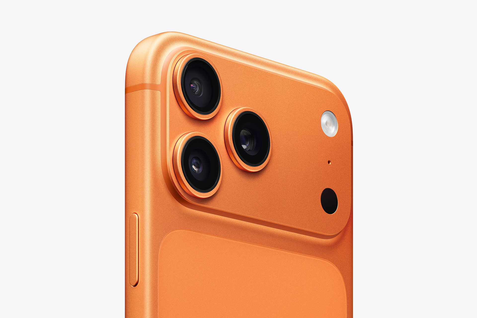
The orange-toned visual style in some Samsung app icons and interface elements became part of that larger conversation because Apple’s early iPhone interface used bold, glossy, color-coded icons that were easy to recognize at a glance. Calendar, Contacts, Music, Messages, and other app icons created a visual language where color and shape made apps instantly readable.
Color alone is not copying. Orange, blue, green, and yellow are basic interface tools. But when color choices, icon shapes, layout, device silhouette, and interaction patterns all point in the same direction, the design starts to feel less like inspiration and more like imitation.
That is why the Samsung dispute still matters. It showed that copying can happen through accumulation. One borrowed cue may be harmless. Many borrowed cues can recreate another company’s identity.
Apple Leadership Made Design a Business Weapon
The reason Apple fought so aggressively was that design had become a leadership strategy.
Under Steve Jobs and Jony Ive, Apple treated industrial design as central to the business, not as a final decoration layer. The iMac, iPod, iPhone, iPad, MacBook Air, Apple Watch, and later Apple silicon Macs all carried the same philosophy: simplify the object, hide complexity, make software and hardware feel joined, and use materials, proportions, and interface details to create desire.
The iPhone was the clearest expression of that approach. It was not only more advanced than many phones of its time. It looked more resolved. It made rivals look dated almost overnight.
That created a problem for competitors. Matching the iPhone’s impact required speed, but speed can tempt companies to copy instead of develop a distinct answer. Samsung’s strength was scale, manufacturing, display technology, supply chain power, and rapid iteration. Apple’s strength was product definition. The legal conflict happened where those strengths collided.
Samsung could move fast. Apple believed Samsung moved too close.
The Labs Behind Competitive Copying
Every major technology company has labs, design teams, testing rooms, and competitive research groups. Engineers tear down devices. Designers study materials. Product managers compare features. Software teams map user flows. Marketing teams analyze names, colors, packaging, and retail presentation.
This is not automatically unethical. Competitive research helps companies learn. It can reveal weaknesses, inspire better solutions, and push industries forward. The smartphone market improved because companies studied one another and responded quickly.
But there is a limit. Reverse-engineering hardware to understand manufacturing is different from cloning the impression of a finished product. Studying usability is different from copying interface behavior. Looking at color trends is different from building a competing identity that feels intentionally familiar to another brand’s customers.
The Apple-Samsung case became a warning because it showed how internal benchmarking can become evidence. Notes, comparisons, screenshots, and design instructions that seem ordinary inside a company can look very different in court when placed beside a competitor’s product.
For technology leaders, that is the uncomfortable lesson: labs need ethical boundaries. “Make it better” is competition. “Make it more like theirs” can become evidence of copying.

Samsung Changed, but the Shadow Remained
Samsung eventually developed a more distinct design identity. Its later Galaxy phones pushed curved displays, larger screens, stylus integration, foldables, advanced OLED panels, and aggressive camera hardware. In many areas, Samsung became a leader, not only a follower.
That makes the early imitation debate more complicated. Samsung was not incapable of innovation. It had world-class manufacturing, display leadership, semiconductor expertise, and the courage to experiment with large phones and foldable devices before Apple. The company’s later success proves it could build its own path.
But the early Galaxy era still carries the shadow of Apple’s accusation. The court fight fixed a public story in place: Apple defined the modern smartphone, and Samsung rushed to close the gap by moving too near to Apple’s choices.
That story may be incomplete, but it remains powerful because it matches what many consumers saw at the time. The market did not only shift toward touchscreens. It shifted toward products that looked and behaved more like iPhone.
The Ethical Line in Design Copying
The Apple-Samsung battle still matters because technology moves through imitation faster than almost any other industry.
Once a product works, rivals study it. Once a feature becomes popular, it spreads. Once a color, gesture, shape, or name becomes successful, it appears elsewhere. Some of that is normal. Users benefit when good ideas become standard. Nobody wants every company to reinvent basic interactions just to avoid similarity.
The ethical line is not always simple. A touchscreen grid of apps became a natural smartphone structure. Rounded corners are common because they are comfortable and durable. Large glass displays became unavoidable as mobile computing advanced. Similarity does not always prove copying.
But copying becomes harder to defend when the full product impression feels borrowed. Hardware shape, UI layout, icon treatment, naming, packaging, and marketing cues can combine into a recognizable imitation. At that point, the issue is not whether one corner or one icon looks similar. It is whether a company is trading on another company’s design leadership.
Apple’s fight with Samsung made that question unavoidable. It pushed the industry to admit that design is intellectual property, business strategy, and brand identity at the same time.
The Imitation Game Never Ended
The smartphone industry has changed since the original Apple-Samsung war. Bezels shrank. Home buttons disappeared. Screens grew. Cameras multiplied. Foldables arrived. AI features now define the next competitive phase.
Yet the imitation game continues. Companies still copy naming patterns, camera layouts, software features, app icons, product colors, event language, titanium finishes, privacy messaging, AI branding, and ecosystem ideas. Apple copies too in some areas, adopting ideas after competitors prove demand. The difference is whether a company transforms an idea into its own system or simply follows the surface.
That is why the Apple-Samsung case remains relevant beyond old patents. It was not only about one phone maker copying another. It was about the cost of leadership in a market where success invites imitation immediately.
Apple’s first iPhone gave the industry a new design center. Samsung’s early response tested how close a rival could move before competition became copying. Courts measured patents and damages. Consumers measured resemblance. Designers measured influence.
The lesson still holds: in technology, copying may be fast, but original design is what sets the direction everyone else tries to follow.