The Apple Watch screen is small by design. That constraint is part of its purpose. You glance, act, and move on. Because the display area is compact, the way apps are arranged affects how quickly you complete simple tasks. A disorganized layout adds small delays. A structured layout removes them.
The layout also affects how the watch feels throughout the day. A crowded screen can create a subtle sense of friction, especially when icons overlap tightly in Grid View. Even if you eventually find what you need, the extra moment of searching changes the rhythm of interaction. On a device designed for speed, that rhythm matters.
Because the Apple Watch is used in short bursts, organization becomes more important than on larger screens. You are often walking, in conversation, or mid-task when you glance at it. A well-arranged app layout supports those quick exchanges. It reduces visual scanning and allows your hand to move with intention instead of hesitation.
Apple Watch App Layout: Grid View vs List View
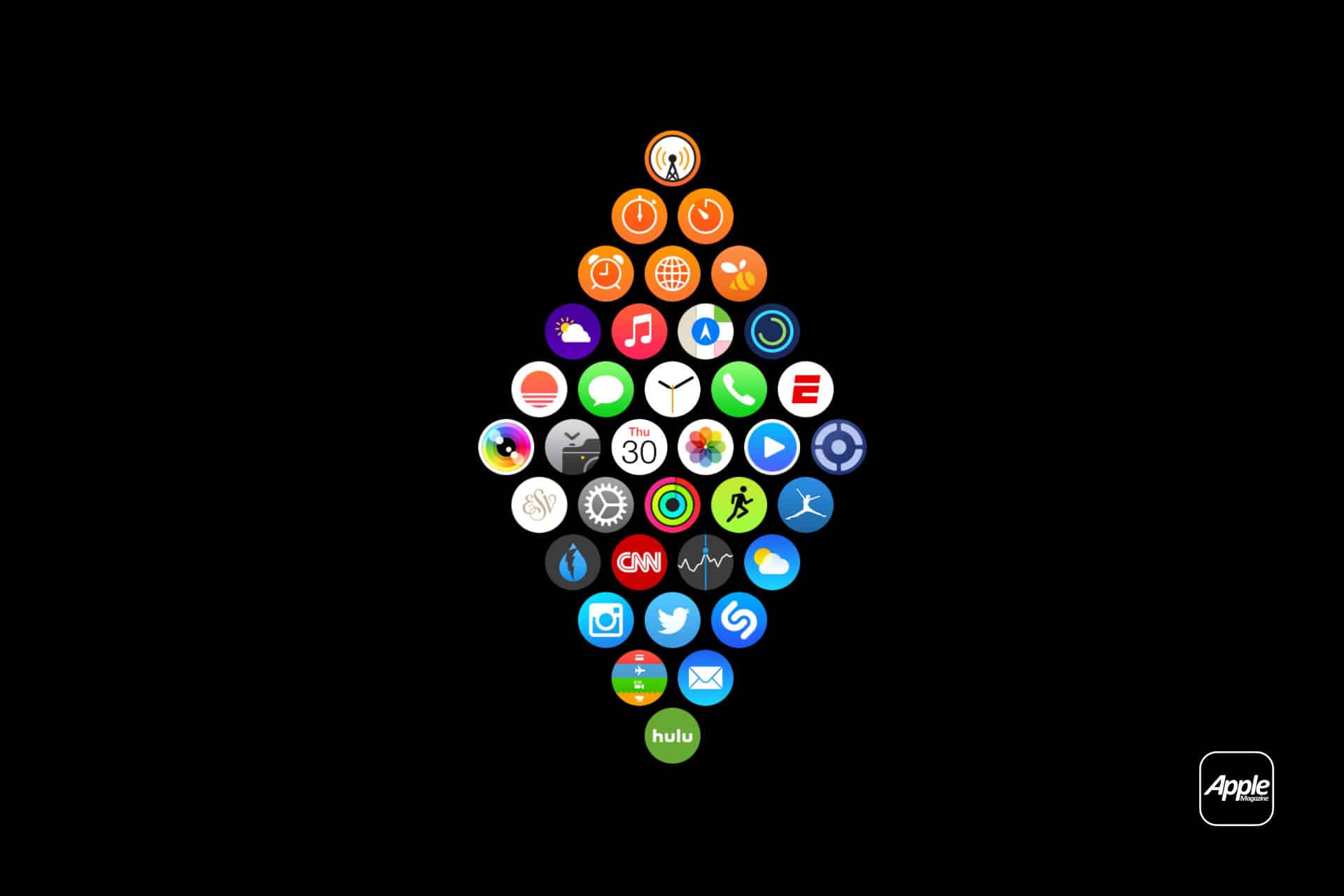
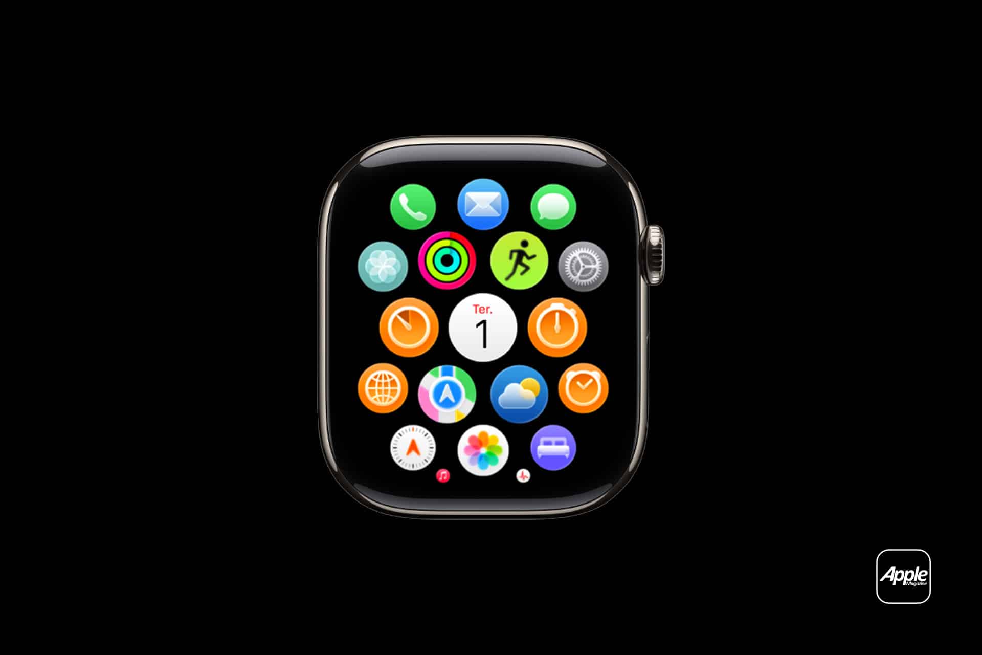
Grid View presents apps in a honeycomb layout. Icons float in clusters and can be rearranged manually. You zoom using the Digital Crown and drag apps into new positions. This layout favors spatial memory. Over time, your thumb learns where things sit. You stop scanning and start moving directly to the area where an app lives.
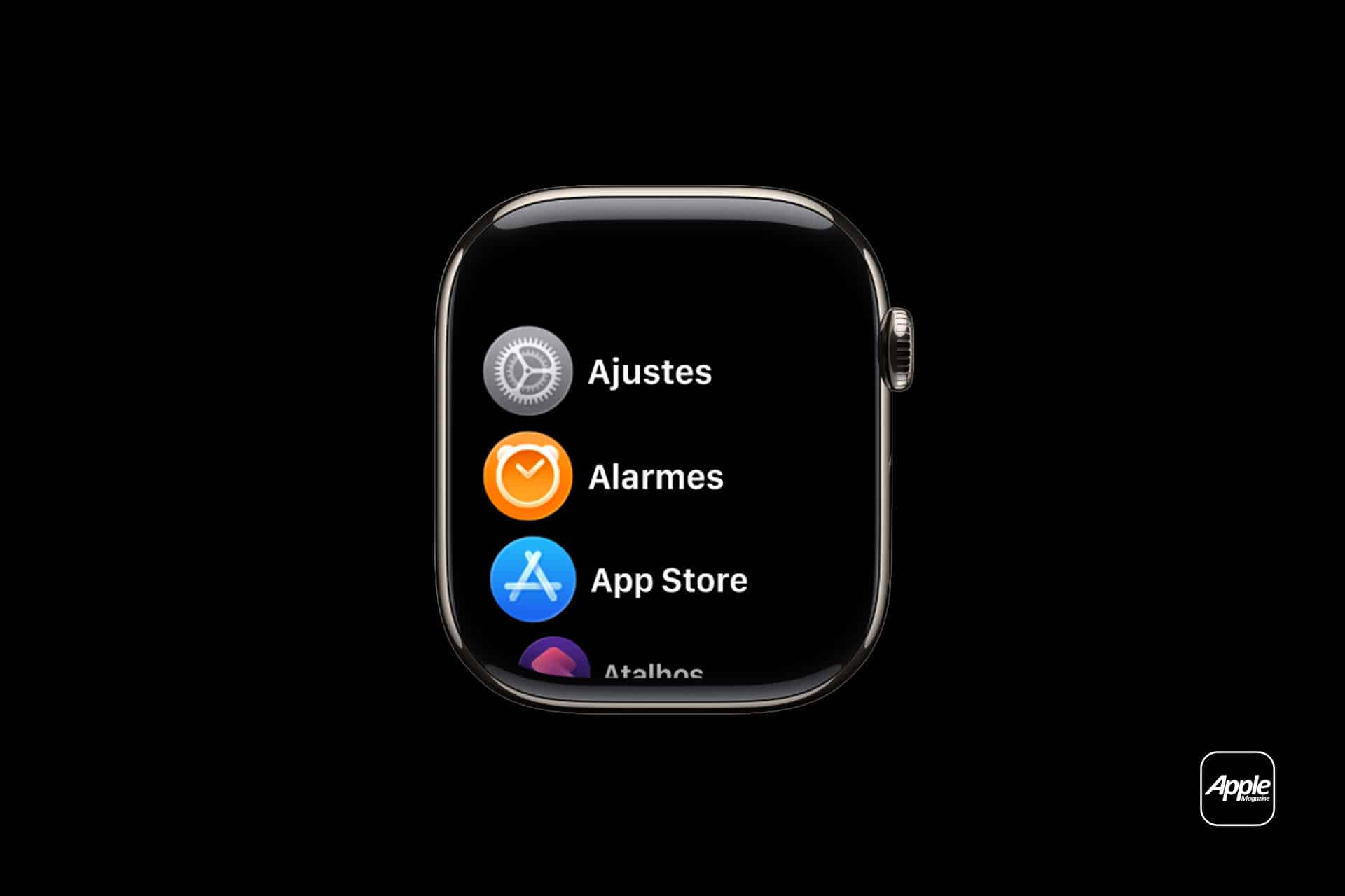
List View arranges apps alphabetically in a vertical column. You scroll through them with the Digital Crown. There is no repositioning because the order follows the app name. This layout favors alphabetical recall rather than spatial placement. If you know the app’s name, you know roughly where it appears in the list.
Neither layout is inherently better. The difference lies in how you prefer to locate information.


Organizing by Importance
In Grid View, importance should determine proximity. Apps used several times a day deserve central placement. The center of the grid requires the least zooming and the shortest finger movement. If Workout, Messages, or Wallet are part of daily habits, keeping them near the center makes access faster without visual searching.
Less-used apps can move toward the edges. They remain available but do not compete for immediate space. This structure reduces clutter while preserving flexibility.
With List View, importance works differently because placement cannot change. Instead, efficiency comes from reducing the total number of apps installed. Removing rarely used apps shortens the scroll length. The fewer entries in the list, the quicker you reach the ones that matter.
Organizing by Category
Another method is grouping by function.
In Grid View, fitness-related apps can sit near each other. Communication apps can cluster in another section. Utilities like Timer and Alarms can occupy their own space. This creates mental zones. You are not looking for a specific icon at first; you are looking for a region.
This approach works particularly well for people who rely on visual grouping. Over time, categories become automatic. Your thumb moves to a general area before identifying the exact icon.
List View does not allow physical grouping, but mental grouping still applies. When scrolling alphabetically, you anticipate clusters based on naming. For example, apps beginning with similar letters often sit near one another. Familiarity shortens search time.
Organizing by Frequency of Use
Frequency often matters more than category. An app opened multiple times per day should require minimal effort to reach. In Grid View, that means central positioning. In List View, it means keeping the list compact.
If certain apps have not been opened in months, removing them from the watch reduces navigation distance. The watch is not a secondary phone. It is a device for quick interactions. Limiting installed apps reinforces that purpose.
Adapting Layout to Context
App layout does not need to remain static. Habits shift over time. During a period focused on fitness, Workout and Activity might move closer to the center. During a work-intensive season, Calendar and Reminders may deserve priority placement.
Adjusting layout occasionally ensures that the interface reflects current routines rather than old ones.
Some users prefer a dense grid with many visible apps. Others prefer minimal presence — only essential tools installed. Both approaches are valid. What matters is that the layout reduces hesitation.
Layout Impacts Speed
The Apple Watch is built for short interactions. You raise your wrist, open an app, perform a task, and lower it again. Even minor delays become noticeable when repeated dozens of times per day.
An unorganized grid forces extra zooming. A long alphabetical list increases scroll time. Structured placement removes those small interruptions.
Layout does not change app functionality. It changes how quickly you reach it.
It can help to reassess app layout every few months. Delete unused apps. Rearrange based on current priorities. Switch between Grid and List to see which feels more natural.
The adjustment takes minutes but affects daily interaction.
When the layout matches your habits, navigation becomes automatic. You press the Digital Crown, move directly to the app, and return to your day without thinking about the path you took.