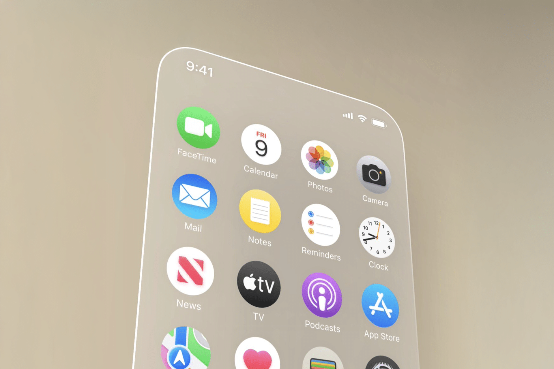
The hallmark of iOS 26’s redesign is its adoption of translucent interface elements, reminiscent of visionOS’s frosted glass aesthetic. In visionOS, app windows use a material Apple calls “glass,” which allows light and background elements to shine through, creating a seamless blend with the user’s surroundings. For iOS 26, this translates to menus and buttons with a sea-glass-like appearance, offering a clean, modern look. Bloomberg reports that this translucency will be evident in apps like Photos, where menus may adopt a subtle, glowing effect, enhancing visual appeal without overwhelming functionality. This approach ensures content remains readable while adding a layer of sophistication.
Floating Navigation Bars and Menus
Navigation in iOS 26 will take cues from visionOS’s floating interface elements. In the Vision Pro, menus and toolbars appear to hover in space, using shading and shadowing for a 3D effect. Apple plans to replicate this on iOS with navigation bars that seem slightly raised above the background, creating a soft, blurred depth effect. That visionOS favors top-aligned toolbars, and iOS 26 may shift in this direction, though user accessibility—especially one-handed use—could temper this change. Apps like Messages and the App Store are expected to feature these floating bars, making navigation feel airy and intuitive.
Rounded Buttons and Softer Edges
While iOS already uses rounded squares for icons and notifications, iOS 26 will push this further with even rounder, softer edges inspired by visionOS. Buttons and interface elements, such as those in the Camera and Messages apps, will adopt a bubble-like, circular design. Leaker Jon Prosser shared mockups showing a redesigned Camera app with pill-shaped, translucent buttons and a rounded keyboard that appears to “float.” This shift aims to create a cohesive, playful aesthetic across Apple’s ecosystem, ensuring buttons and menus feel inviting and less rigid.
Subtle Lighting Effects
VisionOS’s interface dynamically interacts with real-world lighting, adjusting translucency based on surroundings. While this isn’t directly applicable to iPhones, iOS 26 will introduce subtle lighting effects to enhance its glassy design. Dynamic shadowing and adaptive colors will make interface elements blend seamlessly with wallpapers, creating a sense of depth. For example, navigation buttons may shift slightly in hue based on ambient light or wallpaper tones, adding a polished, responsive feel to the user experience.
Streamlined Navigation for Simplicity
Apple is focusing on simplicity with iOS 26, aiming for a less cluttered interface. VisionOS’s airy design, with cleaner fonts and increased line spacing, serves as a model. Bloomberg’s Mark Gurman reports that iOS 26 will streamline navigation and menu layouts, making the system “simpler to use, faster to navigate, and easier to learn.” Apps like Apple Music and the App Store may feature pill-shaped tab bars at the bottom, reducing the need for dedicated interfaces for functions like search. This streamlined approach ensures a fluid experience, particularly on smaller screens.
Cross-Platform Cohesion
The Solarium project isn’t just about iOS—it’s about unifying Apple’s operating systems. MacOS 26, iPadOS 26, tvOS 26, and watchOS 26 will all adopt similar visionOS-inspired elements, creating a consistent look across devices. Gurman notes that this is especially evident in iPadOS, which will gain macOS-like features such as improved multitasking and app window management. The Apple Sports and Invites apps already hint at this design direction, with glassy buttons and rounded interfaces that may become standard across Apple’s ecosystem.
Why It Matters
This redesign comes as Apple shifts its versioning scheme, moving from iOS 19 to iOS 26 to reflect the year ahead (2026), aligning all platforms under a unified naming convention. The visionOS-inspired overhaul aims to modernize the iPhone’s interface, making it more intuitive and visually cohesive with Apple’s broader ecosystem. While the focus is on design, practical benefits include easier navigation and a more immersive experience, particularly for apps like Photos and Camera, where translucency can enhance content visibility. However, the shift to top-aligned toolbars may spark debate among users who prioritize one-handed usability.
The update also responds to competitive pressures. As Android UIs from Google and Samsung adopt similar glossy, translucent elements, Apple’s redesign keeps iOS competitive while reinforcing its premium aesthetic. Posts on X reflect excitement for the “serious visionOS vibes,” with users like @dravidan praising the “slicker, more modern” look, though some express concerns about accessibility for color-blind users or those with smaller hands.
Looking Ahead
Apple’s WWDC 2025 keynote on June 9 will offer the first official glimpse of iOS 26, with a public beta expected in July and a full release in September alongside the iPhone 17 lineup. While the redesign is the centerpiece, additional features like a dedicated Games app and AirPods translation capabilities tied to iOS 26 are also in the works. The focus on design over major AI updates suggests Apple is prioritizing a polished user experience, though delayed Apple Intelligence features may still.