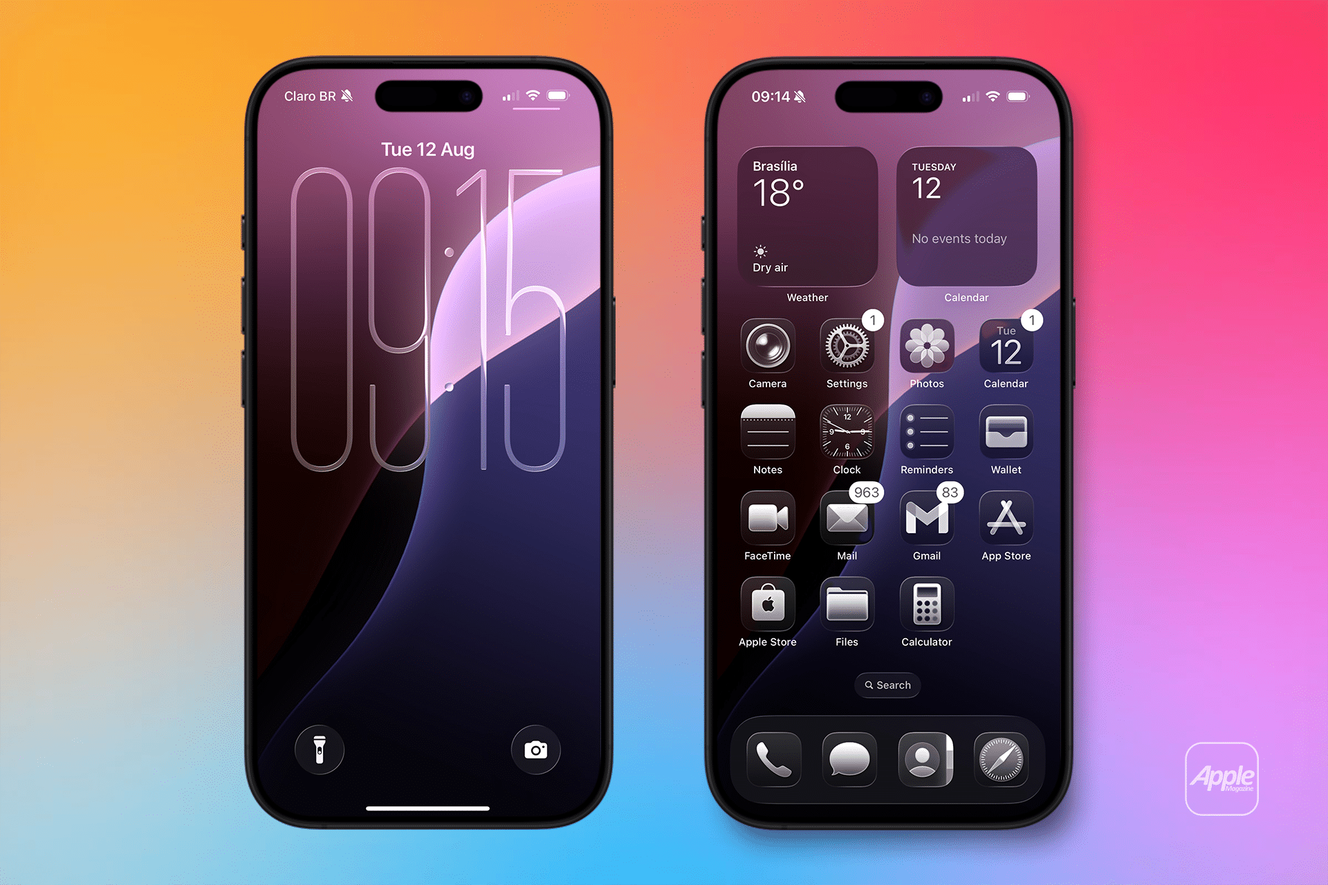
The iPhone’s Lock Screen gets a noticeable update in iOS 26 beta 6, with the clock adopting a more pronounced Liquid Glass effect. This design makes the clock appear more transparent, allowing the wallpaper’s colors and brightness to influence its look. Whether users choose Apple’s new stretched glass wallpaper or a classic photo, the clock dynamically adapts, creating a visually striking effect. For example, a vibrant wallpaper might give the clock a bold, colorful tint, while a darker one lends a sleek, understated appearance. This tweak enhances personalization, letting users’ wallpaper choices shine through in unexpected ways, making every Lock Screen feel unique.
The change also responds to early beta feedback about the Lock Screen’s readability. By fine-tuning transparency, Apple ensures the clock remains clear against varied backgrounds, addressing concerns from testers who found earlier iterations too faint. This update underscores Apple’s iterative approach, using beta cycles to perfect a design that’s both eye-catching and functional for everyday use.
Clearer App Tab Bars for Seamless Navigation
App tab bars, a critical part of iOS navigation, see significant improvements in beta 6. Previous betas faced criticism for legibility issues, particularly when tab text overlapped with design-heavy content like images or gradients. The text could blend into the background, making it hard to read without squinting. Apple has addressed this by adjusting the Liquid Glass effect to maintain text clarity, regardless of what’s displayed underneath. For instance, in apps like Photos or Music, tab labels now stand out crisply, even when scrolling over vibrant album art or complex visuals.
This fix is a practical win for users who rely on tab bars for quick navigation. By prioritizing readability, Apple ensures that the aesthetic appeal of Liquid Glass doesn’t compromise usability. The tweak also reflects a broader trend in iOS 26: refining bold design choices to work seamlessly across diverse apps and content types, from minimalist interfaces to media-rich environments.
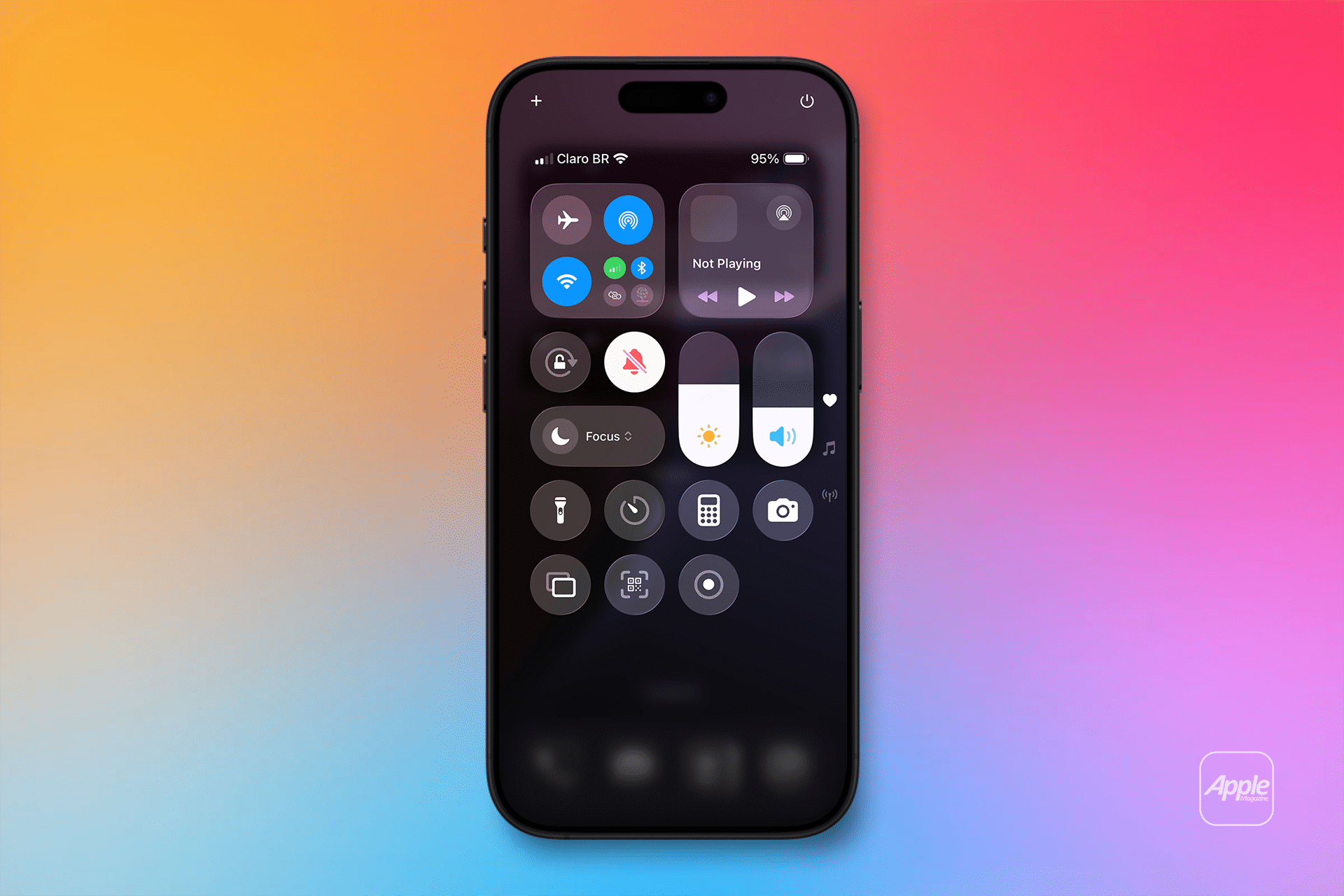
Chromatic Effects Enhance UI Elements
Beta 6 introduces more chromatic Liquid Glass effects across various UI elements, adding a touch of flair to everyday interactions. Toggle switches in the Settings app, for example, now feature a dynamic, glass-like shimmer when tapped, with subtle rainbow-like reflections that catch the eye. Similarly, standard tab bars within apps display enhanced dispersion effects, giving them a more vibrant, polished look. These changes draw inspiration from the fluid, translucent aesthetic of visionOS, the operating system powering Apple’s Vision Pro headset, creating a cohesive visual language across Apple’s ecosystem.
These chromatic touches aren’t just cosmetic—they signal Apple’s intent to make iOS 26 feel lively and modern while maintaining functionality. The effects are subtle enough not to distract but pronounced enough to make routine actions, like flipping a toggle, feel fresh and engaging. For users, this means a more immersive experience that elevates the iPhone’s interface without sacrificing simplicity.
Why These Changes Matter
Apple’s focus on refining Liquid Glass in beta 6 highlights a key priority: user-centric design. By addressing legibility issues and enhancing visual effects, the company is ensuring that its bold new aesthetic doesn’t alienate users who value clarity and ease of use. The updates also show Apple’s confidence in the Liquid Glass vision, first unveiled at WWDC 2025 as a unified design language for iOS, iPadOS, macOS, and beyond. Unlike the “frosted glass” pivot in beta 3, which dialed back transparency after user feedback, beta 6 doubles down on the fluid, translucent look, suggesting Apple is locking in its design direction ahead of the public release.
For iPhone users, these changes mean a more polished and personalized experience. The Lock Screen’s adaptive clock lets users express their style through wallpaper choices, while clearer tab bars make navigation intuitive, even in visually busy apps. The chromatic effects add a layer of delight to mundane interactions, making iOS 26 feel like a meaningful evolution of the iPhone’s interface. As Apple prepares for the public launch, these tweaks position Liquid Glass as a design that’s both innovative and practical, appealing to both longtime iPhone fans and newcomers.
Beyond Liquid Glass: Other Beta 6 Highlights
While Liquid Glass steals the spotlight, iOS 26 beta 6 includes other user-focused updates. New ringtones offer fresh customization options, letting users set distinctive tones for calls and notifications. App launch speeds have been optimized, making the iPhone feel snappier, especially for resource-intensive apps like Camera or Maps. Speaking of Camera, Apple has reversed a controversial swipe direction for switching shooting modes, responding to user complaints about the change in earlier betas. These updates, combined with Liquid Glass refinements, show Apple’s holistic approach to improving iOS 26, addressing both aesthetics and performance.
Looking Ahead
As the iOS 26 public launch approaches, beta 6 suggests Apple is nearing the finish line for its Liquid Glass design. The focus on legibility, personalization, and subtle visual flair indicates a design that’s ready for prime time, capable of delighting users while maintaining the iPhone’s hallmark simplicity. For tech enthusiasts, these updates offer a glimpse into how Apple is balancing innovation with usability, ensuring iOS 26 feels like a natural evolution of the platform. Whether you’re a beta tester or waiting for the final release, the latest changes make it clear: Liquid Glass is here to stay, and it’s getting better with every iteration.