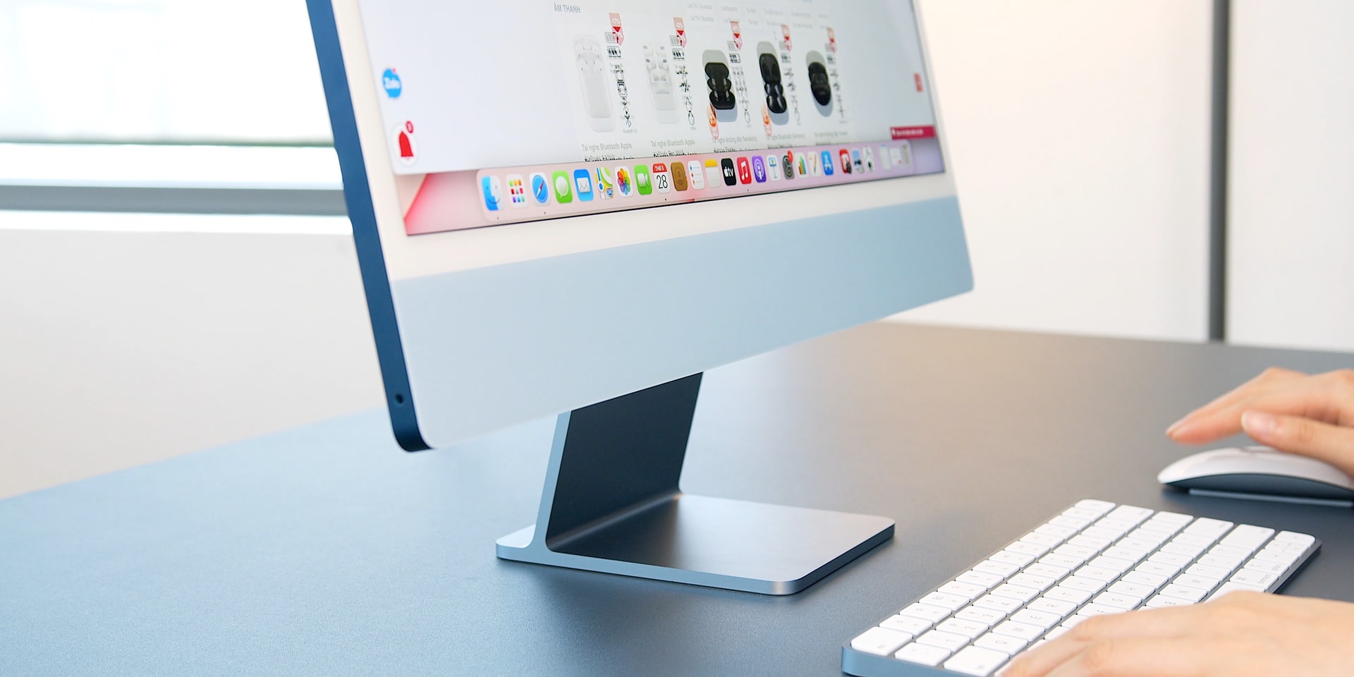
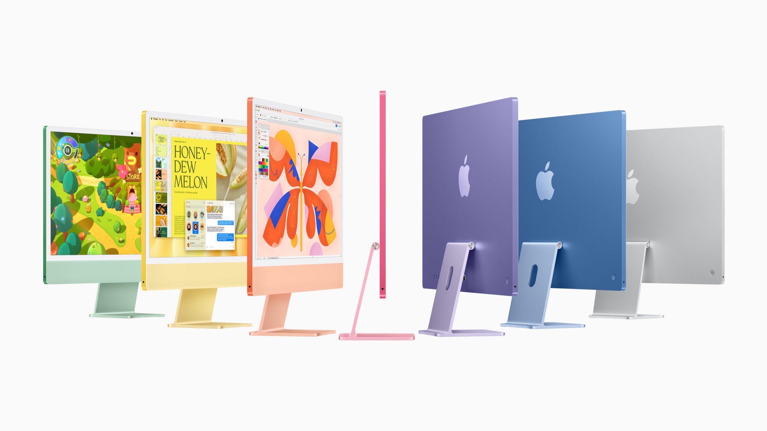
The M1 iMac’s chin has always been a polarizing feature. By housing critical hardware like processors and cooling systems, it allows the rest of the device to remain remarkably thin—less than half an inch at its slimmest point. Yet, its size and prominence drew mixed reactions. Some praised the clean, modern look, accentuated by white bezels and a range of colors from blue to pink. Others felt the logo’s absence made the design feel incomplete, almost like a third-party knockoff. The chin’s blank canvas sparked debates among users, with some even joking it was the perfect spot for Post-It notes rather than a brand mark.
Prototype Revelations
A leaker known as Kosutami recently shared an image on social media, revealing a prototype of the 24-inch M1 iMac with an Apple logo centered on its chin. According to Kosutami, Apple explored this design during the early stages of development, specifically before the Engineering Validation Test (EVT) phase. This stage, one of four in Apple’s rigorous product development process, focuses on testing core functionality and design feasibility. The decision to scrap the logo came relatively early, suggesting Apple intentionally leaned into a minimalist front-facing aesthetic. While Kosutami’s track record includes both accurate and questionable leaks, the prototype aligns with Apple’s known practice of testing multiple design variations.
Why Ditch the Logo?
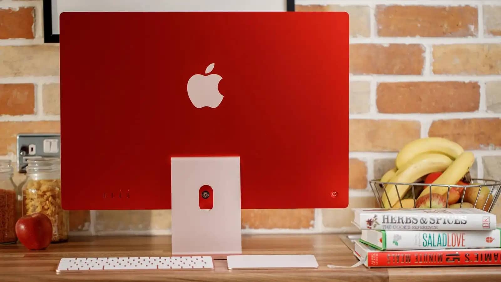
Apple’s choice to remove the front-facing logo likely ties to its broader design philosophy. The M1 iMac’s redesign emphasized simplicity and color, with the logo on the back—still prominently displayed—deemed sufficient for brand recognition. Removing the chin logo may have been a deliberate move to avoid visual clutter, letting the device’s vibrant hues and slim profile take center stage. The chin’s functional role in housing components also meant Apple prioritized engineering efficiency over decorative branding. While some users argue the logo would have added a touch of familiarity, others appreciate the clean look, which aligns with Apple’s trend toward understated elegance in products like the iPhone and MacBook.
User Reactions and Design Impact
The prototype leak has reignited discussions about the iMac’s design. On forums and social media, opinions vary widely. Some users feel the logo would have grounded the iMac’s bold new look, making it instantly recognizable as an Apple product. Others argue the logo-free chin enhances the device’s modern appeal, avoiding the “branded” look some associate with lower-end electronics. The debate reflects broader questions about Apple’s design evolution, where functionality and aesthetics often intertwine. The chin, while practical for hardware, remains a lightning rod for criticism, with or without a logo.
What’s Next for the iMac?
The M1 iMac’s design has carried forward to models with M4 chips, and leaks suggest an M5-powered iMac may arrive later this year with minimal design changes. Whether Apple revisits the front-facing logo in future iterations remains unclear, but the prototype offers a fascinating glimpse into the company’s decision-making. For now, the iMac’s chin—logo or not—continues to spark conversation, proving that even small design choices can have a big impact.
