

Design novelty has always been one of Apple’s greatest strengths and one of its most dangerous habits. The company became famous for turning technology into objects and interfaces that felt simpler, more beautiful, and more human than what came before. But Apple’s history also shows a repeated risk: when a new design idea is too focused on visual impact, thinness, cleverness, or future potential, it can become friction before it becomes progress.
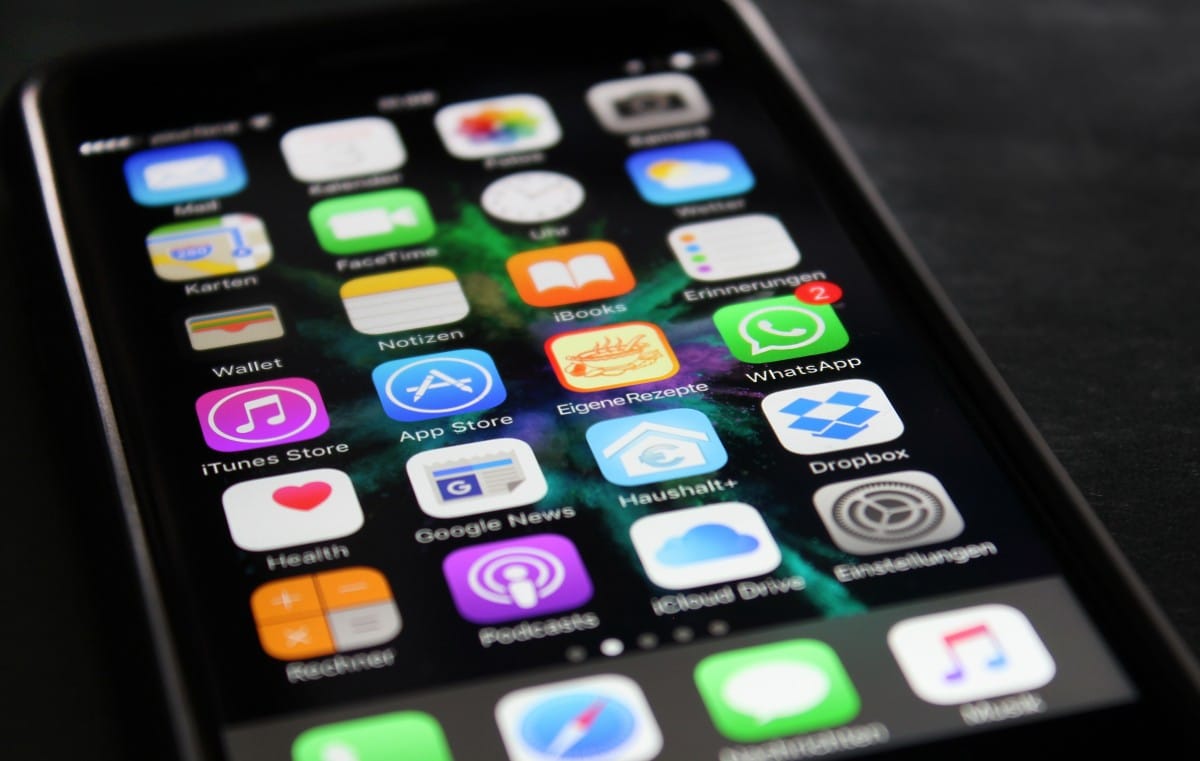
That tension runs through many Apple eras. The original iMac made computers friendlier by turning beige boxes into colorful objects. The iPod click wheel made thousands of songs feel manageable. The iPhone’s multitouch interface removed the keyboard and changed the phone industry. The MacBook Air made thinness a mainstream expectation. Dynamic Island turned a hardware cutout into a software surface. Those were design bets that worked because novelty served use.
The harder examples are different. iOS 7’s flat redesign looked modern, but early versions created readability and discoverability concerns. The Butterfly Keyboard made MacBooks thinner, but reliability problems turned a design achievement into years of user frustration. The Touch Bar promised a dynamic control strip, but many users missed physical keys and predictable controls. Force Touch and 3D Touch added depth to interaction, but the gestures were often hidden. Liquid Glass brought a striking new interface language, but some users complained about readability, motion, and visual intensity.
The lesson is not that Apple should stop taking design risks. Apple becomes weaker when it plays too safely. The lesson is that novelty must earn its place in daily use. A feature cannot only look impressive in a keynote, render beautifully in a product video, or show Apple’s design ambition. It has to survive the ordinary day: typing, reading, charging, commuting, messaging, working, studying, editing, navigating, gaming, and using the device in imperfect light, with imperfect attention, under time pressure.


When Beauty Hides Function
Design novelty becomes user friction when beauty makes function harder to see. iOS 7 is one of the clearest examples. The 2013 redesign replaced skeuomorphic textures with a flatter, brighter, lighter interface. It was a dramatic break from the earlier iPhone look, and it helped set Apple’s visual direction for the next decade.
The first version also exposed the danger of removing too many visual cues at once. Nielsen Norman Group’s early appraisal of iOS 7 argued that flat design could hide calls to action and make edge gestures interfere with scrolling and other controls. That criticism captured a real problem: users had to relearn which elements were buttons, which were labels, and where interaction lived. The interface looked cleaner, but some meaning had been stripped away.
Apple did not reverse iOS 7. It refined it. Over later releases, contrast improved, typography matured, motion settings became more important, and developers learned the new visual language. The design survived because Apple treated it as a foundation to polish rather than a finished answer.
Liquid Glass now faces a similar test. The iOS 26 interface gave Apple’s platforms a more translucent, layered, animated identity. It opened a rich design direction for iPhone, iPad, Mac, Apple Watch, Apple TV, and Vision Pro. But the same qualities that make Liquid Glass feel fresh can also create friction when transparency reduces contrast or motion makes the system feel too busy. Some users have already turned to accessibility settings such as Reduce Transparency, Increase Contrast, and Reduce Motion to make the interface more comfortable.
The lesson for iOS 27 and beyond is direct. Apple does not need to abandon visual ambition. It needs to make the interface adjustable enough that beauty does not become a readability problem. A stunning UI is only successful if users can live in it for years.

When Thinness Costs Trust
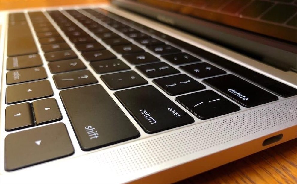
Design novelty also becomes friction when form compromises reliability. The Butterfly Keyboard is the strongest Mac example. Apple introduced the mechanism as part of a push for thinner, more stable-feeling keyboards. On paper, it fit the company’s design language perfectly: slimmer hardware, tighter engineering, and a more modern feel.
In practice, the mechanism became associated with stuck keys, repeated letters, missed presses, and repair frustration. Apple eventually created a Keyboard Service Program for eligible MacBook, MacBook Air, and MacBook Pro models, covering machines affected by certain keyboard issues. The program itself became proof that the design tradeoff had gone too far.
The Butterfly Keyboard problem damaged trust because typing is not a secondary feature on a Mac. It is the core interaction. A laptop can be thinner, lighter, and visually cleaner, but if the keyboard is unreliable, the product fails at its most basic job. Apple eventually moved back to a scissor mechanism in the Magic Keyboard, restoring the kind of reliability users expected.
This is one of the most important lessons in Apple history. Design innovation cannot be allowed to weaken the primary function of a device. A MacBook keyboard must be dependable before it is thin. An iPhone interface must be readable before it is beautiful. A headset must be comfortable before it is futuristic. A watch must be glanceable before it is visually rich.
Apple’s best products make tradeoffs invisible. Its weaker design moments make the tradeoff too visible every day.

When Cleverness Is Too Hidden
Design novelty can also fail when users cannot discover it naturally. 3D Touch and Force Touch had real technical elegance. Pressing harder could reveal shortcuts, previews, and secondary actions. On the Mac trackpad and Apple Watch, pressure-sensitive input gave Apple another dimension of interaction. On iPhone, 3D Touch offered peek-and-pop previews, quick actions, and faster workflows.
The problem was discoverability. Many users never knew which items supported pressure gestures. The feature had no obvious visual signal, and long press eventually absorbed many of its jobs. Apple removed 3D Touch from iPhone hardware and shifted toward Haptic Touch, which used time and haptics rather than pressure-sensitive display hardware.
That does not mean the idea was useless. It means a powerful interaction can lose if it is not visible, consistent, or essential. Apple often likes hidden elegance, but hidden features only work when they become part of habit. If users need to guess whether something supports a gesture, many will stop trying.
The Touch Bar faced a related problem. It replaced the physical function row on some MacBook Pro models with a dynamic strip that changed by app. The concept was clever: context-sensitive controls, sliders, emoji, media controls, editing tools, and shortcuts in one place. The friction was predictability. Many professionals wanted physical Escape, function keys, and controls they could use without looking down. The Touch Bar asked users to shift attention from screen to keyboard surface, which interrupted muscle memory.
Apple eventually removed the Touch Bar from its main MacBook Pro lineup and restored a full-height physical function row. Again, the lesson was not that dynamic controls are always bad. It was that novelty should not replace predictable controls when predictability is the value.
When a New Idea Needs Time
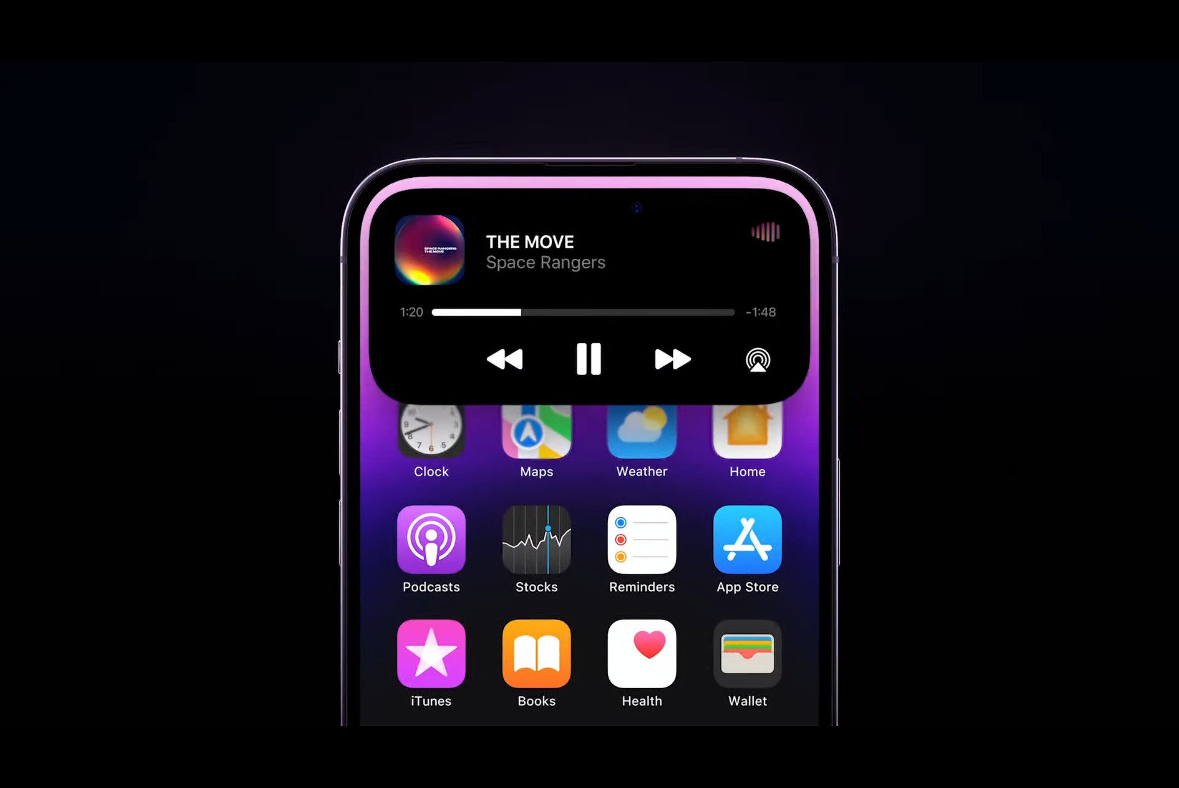
Some Apple design novelties start with skepticism and become accepted after refinement. Dynamic Island is a useful recent example. The hardware cutout could have been treated as a compromise. Apple turned it into a live software area for alerts, timers, music, calls, rides, sports scores, and ongoing activities. The idea worked because it solved a visible hardware problem with useful interface behavior.
Dynamic Island also shows why novelty succeeds when it has a clear job. It was not only decorative. It gave the iPhone a new live-status surface. Users understood what it was for quickly because the feature appeared when something active was happening. It did not require deep settings, hidden pressure, or a new mental model for every app.
That is the bar Liquid Glass, Siri’s new interface, Vision Pro gestures, and future Apple Intelligence surfaces need to meet. A new design language should not only look like the future. It should make the system easier to understand, not harder. It should give users more clarity, not more ambiguity.
Apple’s strongest design novelties become obvious after a short learning curve. The iPod click wheel, multitouch gestures, MagSafe, AirDrop, Dynamic Island, and Apple Watch activity rings all had a clear purpose. The user could explain them quickly. That is usually a sign that novelty is becoming utility.

What Apple Should Learn
Design novelty becomes safe when Apple follows a few hard lessons from its own history. First, preserve the primary function. A keyboard must type reliably. A phone must be readable. A watch must be glanceable. A TV interface must be navigable from a couch. A headset must be comfortable enough to use. No design idea should be allowed to compromise the core job.
Second, make new interactions discoverable. Hidden gestures, pressure levels, and context controls can delight power users, but they should not become the only way to access important functions. If a feature is valuable, users need visible paths to find it.
Third, provide controls for intensity. Liquid Glass is a good example. Some users will want the full visual effect. Others will need stronger contrast, less transparency, or less motion. Accessibility settings should not feel like emergency exits from the design. They should feel like part of the design system.
Fourth, refine quickly. iOS 7 survived because Apple improved it. The Butterfly Keyboard became a lesson because the hardware problem lasted too long. AI-era software will need faster refinement than old yearly cycles, especially when interface changes affect daily use.
Fifth, avoid novelty as status signaling. A feature should not exist mainly to make the product look different from last year’s model. Apple is strongest when difference is tied to use: better typing, easier sharing, clearer status, faster navigation, safer privacy, stronger accessibility, better creative control.
Design Trust Comes From Restraint
Apple’s design reputation was built not only on boldness, but on restraint. The company became famous for removing what was unnecessary. The risk is that removal can go too far. Too few visual cues can make an interface harder. Too few ports can frustrate workflows. Too thin a keyboard can weaken reliability. Too hidden an interaction can disappear from user behavior.
The next phase of Apple design will face this challenge more often because the company is moving into more dynamic interfaces. Liquid Glass, spatial computing, AI assistants, Dynamic Island, app intents, and multimodal input all make the interface more fluid. That fluidity can feel magical, but it can also become unstable if users do not know what the system is doing.
Apple Intelligence makes the lesson even more important. A Siri interface can be beautiful, but users need to understand when Siri is listening, thinking, using personal context, calling an app, or sending a request to an outside model. A glowing animation is not enough. The design has to communicate state, privacy, and control.
The future of Apple design should not be less ambitious. It should be more accountable to use. Novelty should arrive with escape routes, accessibility controls, strong defaults, clear feedback, and fast refinement. The best Apple design does not ask users to admire the idea. It lets them forget the idea because the product simply works better.
Apple’s history shows that the company can turn bold design into lasting standards. It also shows that some of its most beautiful or clever decisions became friction when they ignored daily reality. The lesson is not to fear change. It is to remember that design becomes great only after the novelty stops being the point.