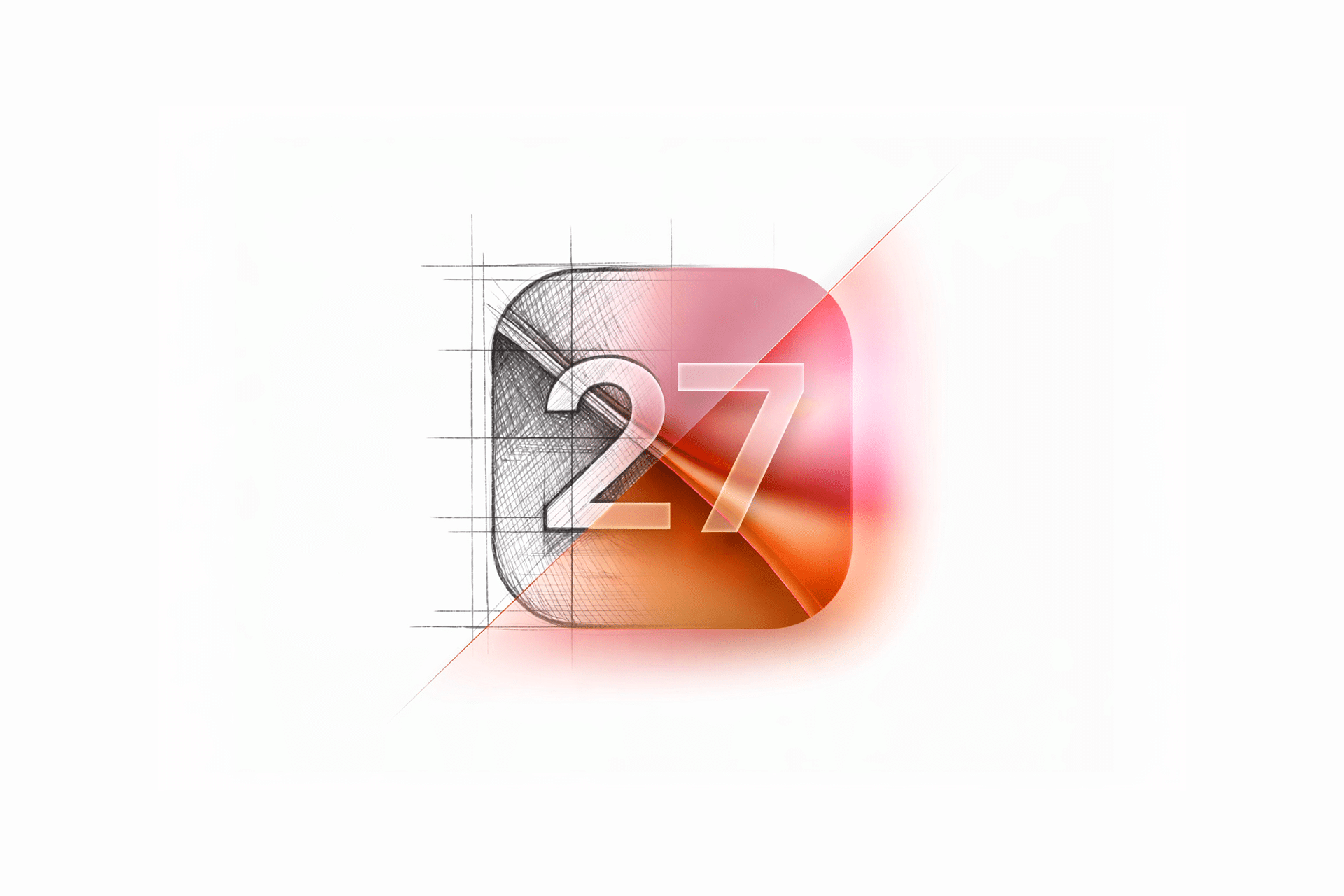
Apple tends to follow a predictable rhythm with iOS releases. Major design ideas are introduced first, then carefully refined over subsequent versions. In that context, iOS 27 is expected to be a year of adjustment and polish rather than reinvention, building directly on the Liquid Glass interface language introduced in iOS 26.
As WWDC 26 approaches, expectations point toward measured improvements that make Liquid Glass more practical, more readable, and easier for developers to apply consistently across apps.
Liquid Glass Enters Its Refinement Phase
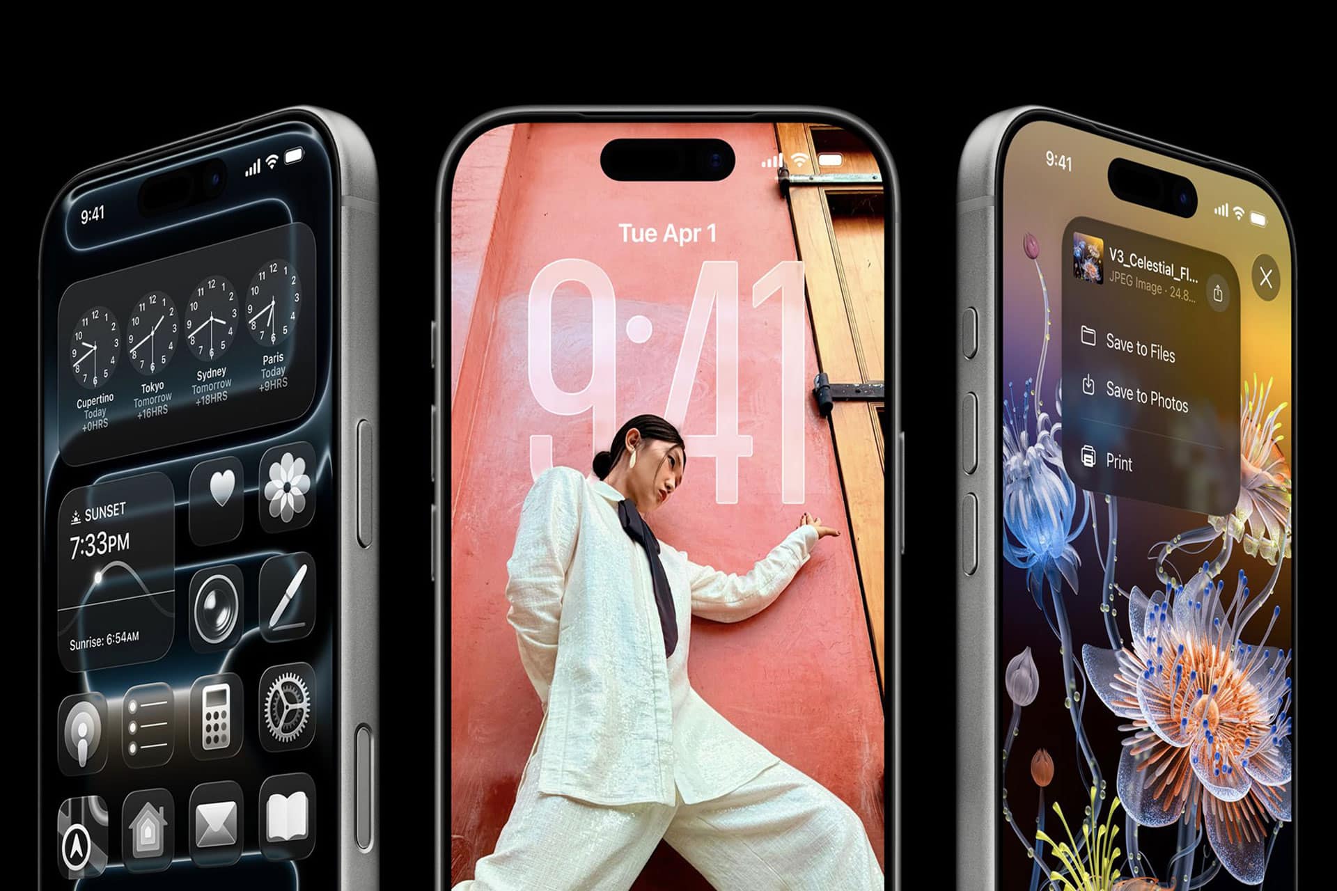
Liquid Glass brought translucency, depth, and motion back to the center of iOS design. While visually striking, early adoption highlighted challenges around contrast, legibility, and visual consistency across different wallpapers and lighting conditions.
iOS 27 is likely to improve Liquid Glass through more adaptive contrast algorithms. Instead of changing the look dramatically, Apple is expected to fine-tune how transparency responds to background content, brightness, and motion, ensuring text and controls remain clear without sacrificing the layered aesthetic.
For developers, refinements may include clearer guidelines and updated tools to ensure app icons and interface elements behave consistently within the Liquid Glass system.
Subtle Evolution Toward Tinted Glass
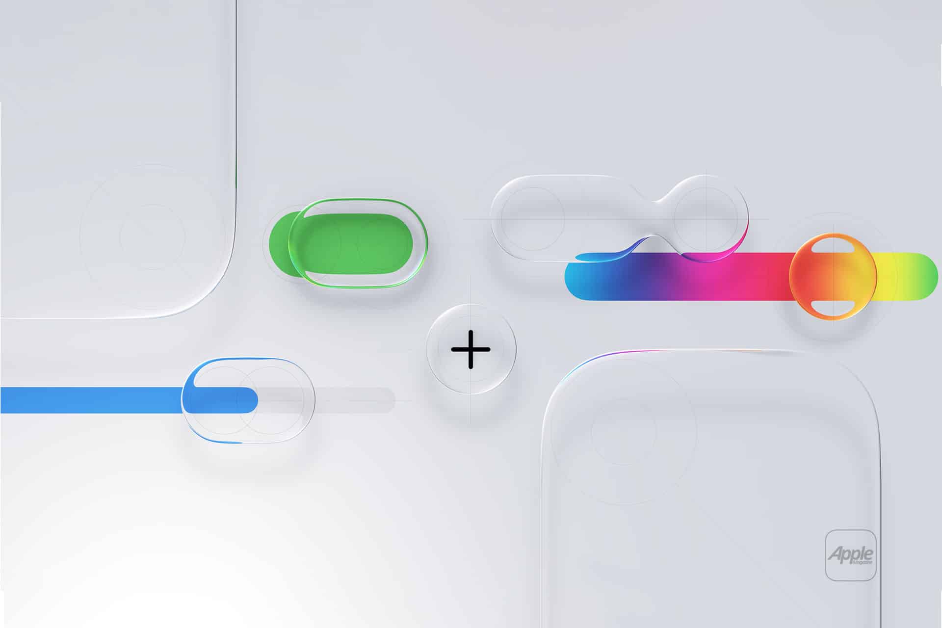
Rather than replacing Liquid Glass, Apple may introduce restrained color integration. Light tinting layered within glass effects could add warmth and visual distinction while maintaining clarity. This would allow Apple to soften the interface without introducing visual noise or fragmenting the design language.
Such an approach aligns with Apple’s historical preference for subtle shifts that improve usability rather than chase visual novelty.
Core App Improvements Over Visual Change
Beyond interface polish, iOS 27 is expected to focus on everyday apps where refinement matters most. Safari remains a likely area of attention, with continued work on performance, privacy controls, and tab organization.
Mail may also benefit from improved visual hierarchy and smarter content handling, especially for users managing large inboxes. These changes are expected to prioritize clarity and speed rather than dramatic redesigns.
Lock Screen and Magic Island Adjustments
The Lock Screen, now a key personalization surface, is likely to see refinements aimed at reducing clutter and improving readability over complex wallpapers. Widget spacing, notification layering, and motion effects may be subtly adjusted to feel calmer and more predictable.
Magic Island is also positioned for refinement rather than expansion. Improvements may focus on smoother transitions, better prioritization of live activities, and more consistent behavior across third-party apps.
WWDC 26 Sets a Conservative Tone
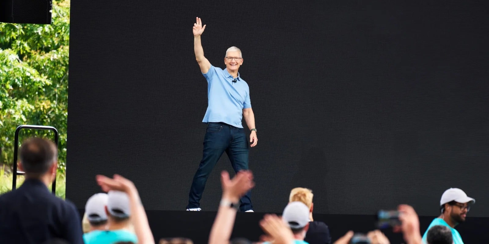
WWDC 26 is expected to frame iOS 27 as a stability and polish release. Apple often uses these cycles to respond directly to user feedback, addressing friction points that emerge after a major design shift.
Liquid Glass appears to be a long-term design direction, and iOS 27’s role is likely to make it feel settled and dependable rather than experimental.
A More Practical iOS Experience
If iOS 26 introduced Liquid Glass, iOS 27 looks set to make it comfortable. Refinements in contrast, developer tools, and core apps suggest Apple is prioritizing usability and consistency over visual ambition.
Rather than signaling a new visual era, iOS 27 appears focused on making the current one work better in daily use.
