
iOS includes a range of accessibility features designed to make the display easier to use for people with light sensitivity or visual discomfort. Among them, Reduce White Point allows you to tone down the intensity of bright colors and whites on the screen — making even the lowest brightness setting feel softer and more comfortable, especially in dark environments.
What Reduce White Point Does
When activated, Reduce White Point decreases the intensity of bright colors without altering the overall contrast structure of the screen. Unlike Night Shift, which warms the display color temperature, Reduce White Point keeps color balance intact while reducing the visual intensity of whites and bright elements. This can help reduce glare and fatigue during extended use in dim lighting or at night.
How to Set Up Reduce White Point
To enable Reduce White Point on your iPhone or iPad:
Settings > Accessibility > Display & Text Size > Reduce White Point
Toggle the switch to turn this feature on, and then use the slider to adjust how much dimming you want. Higher percentages result in a darker and softer appearance of bright colors on screen.
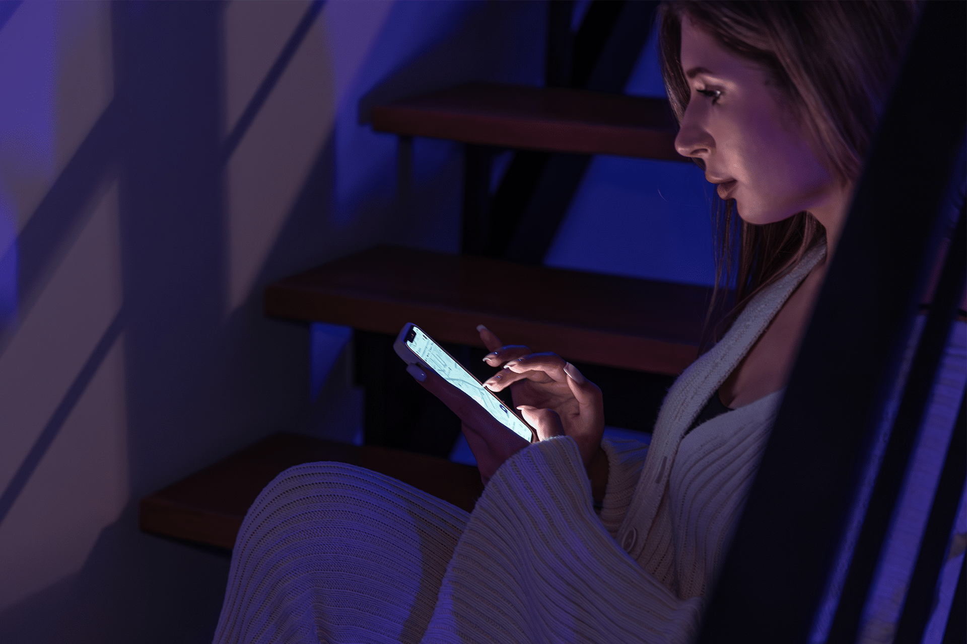
Once active, your display overall brightness appears lower than the standard minimum, making it easier to use the device without straining your eyes. Some users find this especially helpful when reading articles, browsing the web, or scrolling social feeds late at night.
Adding Reduce White Point to Control Center
If you use Reduce White Point frequently, you can add quick access to Control Center:
Settings > Control Center > Add “Reduce White Point”
This lets you toggle the feature on or off quickly without navigating deep into settings.

Accessibility Shortcuts and Reduce White Point
iOS also allows you to activate features like Reduce White Point via a triple-click of the Side or Home button:
Settings > Accessibility > Accessibility Shortcut > Reduce White Point
Once set, a triple-click brings up the shortcut menu so you can instantly enable or disable the setting.
Use Cases and Tips
Reduce White Point is most beneficial in low-light conditions when even the lowest screen brightness feels too intense, or for users with light sensitivity who find bright whites uncomfortable. It doesn’t warm the color like Night Shift, but it does reduce overall visual intensity.
Keep in mind that, because it affects bright colors broadly, some apps and images — particularly ones with vibrant whites — may look more muted when the feature is engaged. Adjust the slider to find a balance that suits your comfort.