Apple rarely changes direction all at once. When it does, the shift is intentional. The iPhone 17 Pro represents one of those moments. Alongside a reworked exterior and major internal performance gains, Apple introduced a color lineup that feels deliberately provocative.
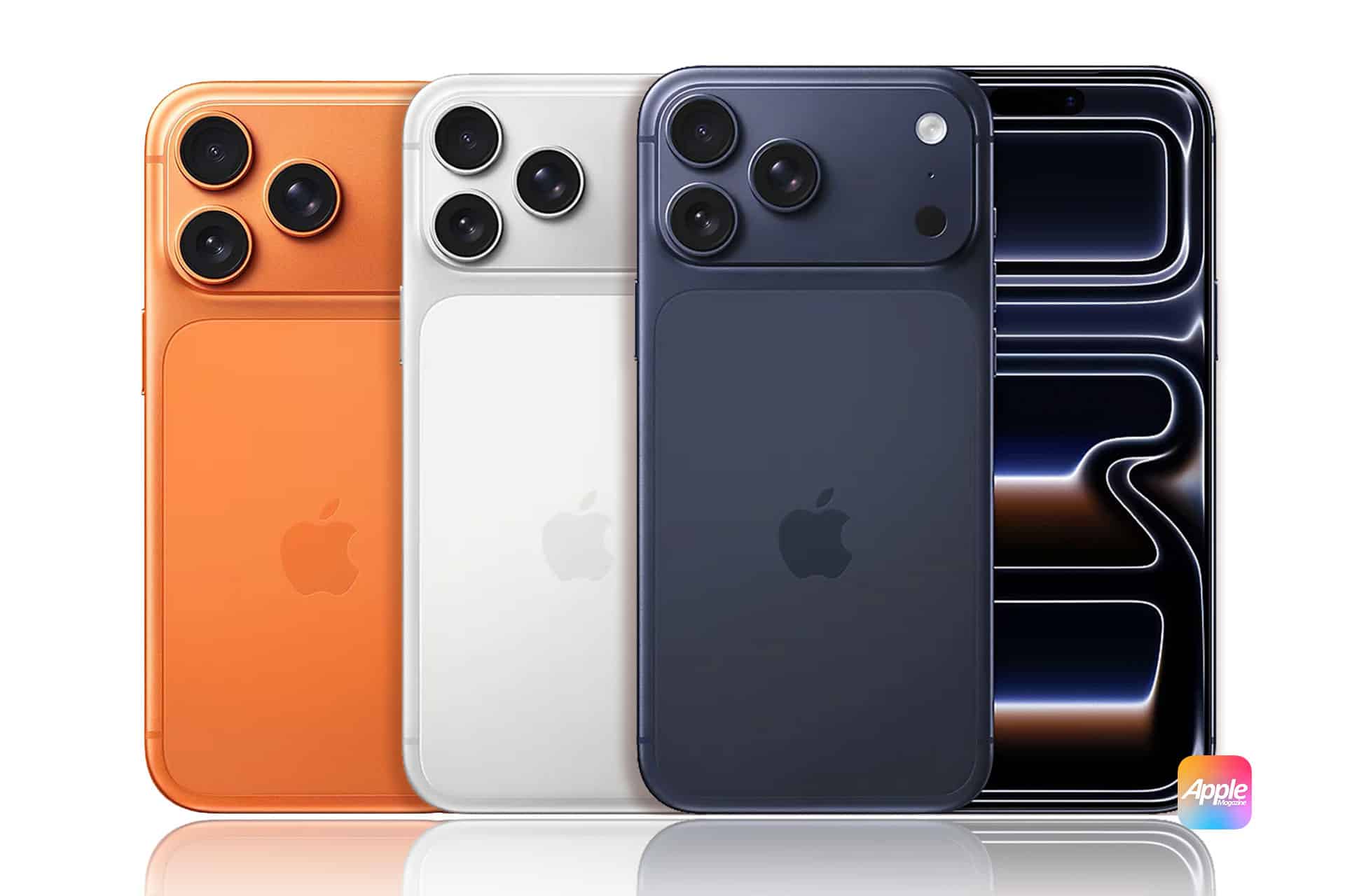
Orange. Blue. Silver. These are not quiet finishes meant to fade into the background. They are meant to be noticed.
A Color Strategy That Mirrors the Hardware
The iPhone 17 Pro’s new colors arrive alongside a more assertive physical design. Sharper lines, stronger materials, and a less delicate visual language set the tone. The finishes follow that same philosophy.
Rather than playing it safe with subtle variations, Apple chose colors that emphasize contrast and presence. The palette feels closer to industrial design than fashion, reinforcing the idea that the iPhone 17 Pro is a tool built for power, not just polish.
This approach echoes what Apple previously achieved with the Apple Watch Ultra, where bolder materials and finishes helped redefine what a premium Apple product could look like.
Cosmic Orange: The Statement Finish
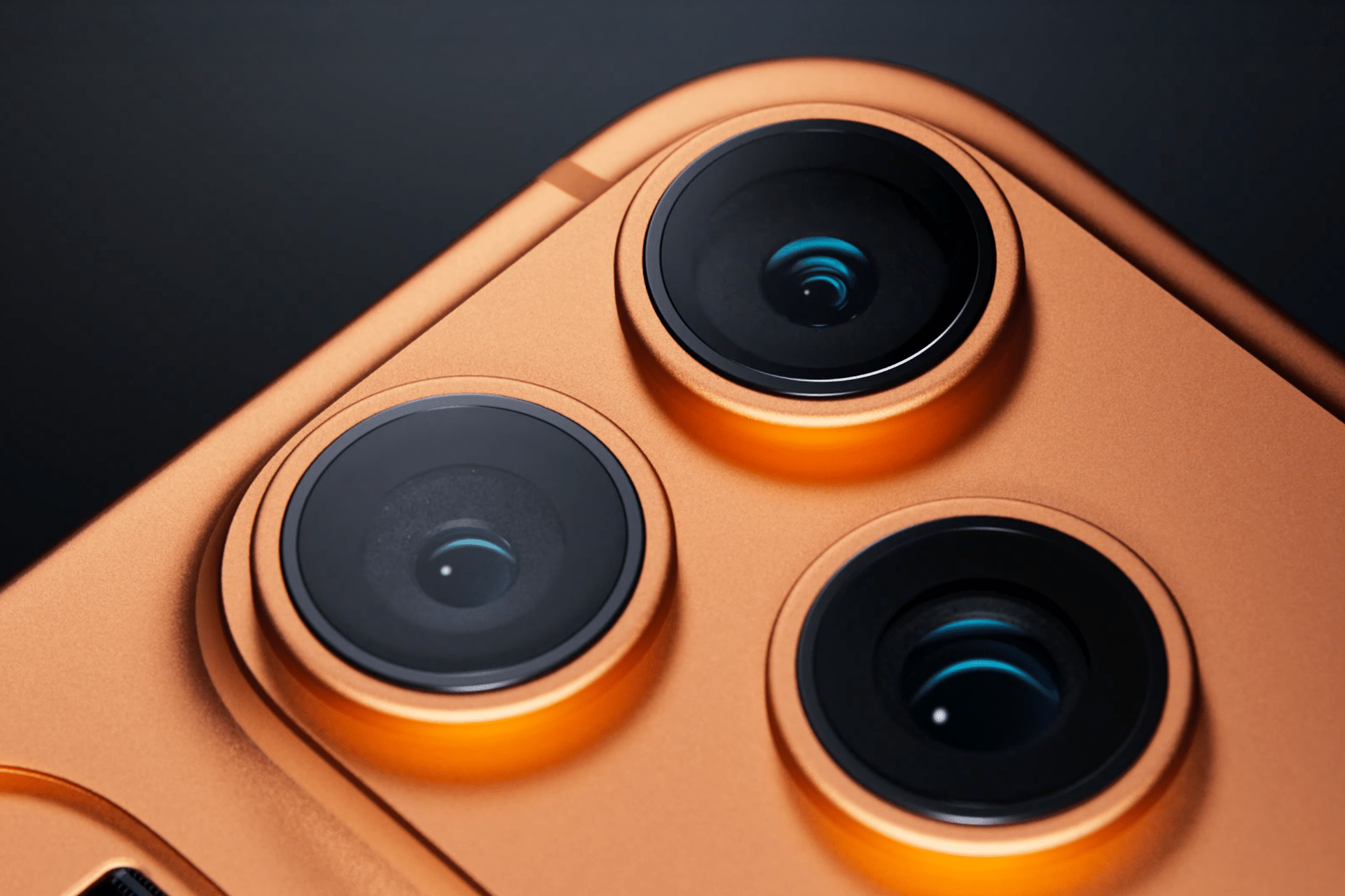
The orange iPhone 17 Pro is impossible to ignore. It signals confidence and intention, standing apart from the muted tones that have dominated recent Pro models. This is not an accent color. It is the product’s personality on display.
In the hand, the finish feels less playful and more purposeful, pairing brightness with the device’s solid construction. It invites strong reactions, and that appears to be the point. Apple is comfortable letting users decide whether they love it or not.
Deep Blue: Precision With Character
The blue option strikes a different balance. Cooler and more controlled, it leans into precision rather than spectacle. This shade feels engineered, aligning with the Pro lineup’s focus on performance, cameras, and computing power.
It offers distinction without excess, making it the most familiar bridge between Apple’s past Pro colors and its new direction. For those drawn to boldness without full commitment, blue sits comfortably in between.

Silver: A New Take on Classic
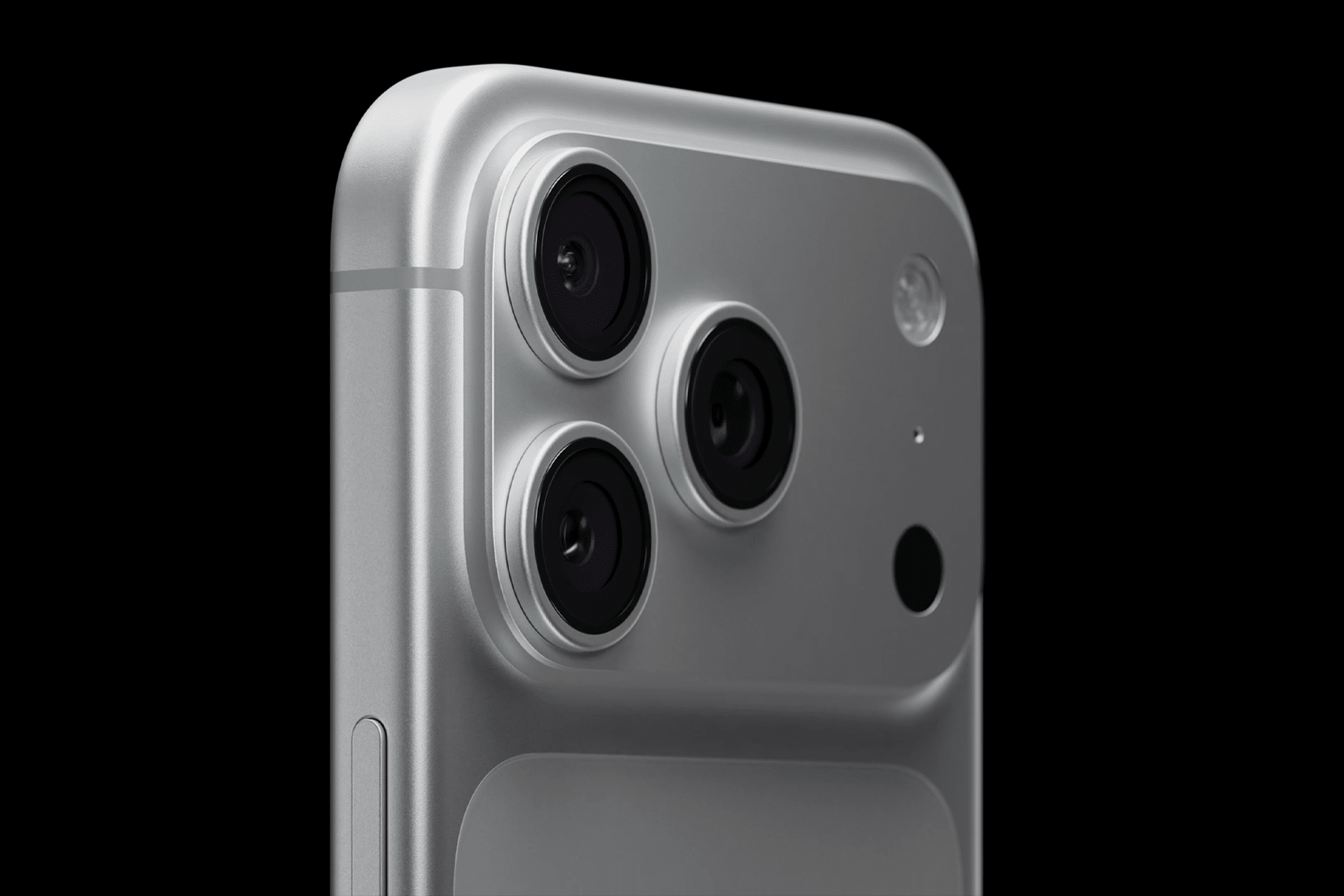
Silver remains the anchor. Clean, reflective, and restrained, it connects the iPhone 17 Pro to Apple’s long design history. Yet even here, the finish feels updated, interacting differently with light thanks to changes in materials and surface treatment.
Rather than serving as a neutral fallback, silver now highlights the new form factor, emphasizing edges, curves, and depth that previous designs kept subtle.
Color as Identity, Not Decoration
What makes the iPhone 17 Pro colors notable is not their variety, but their intent. Apple is no longer using color simply to refresh a lineup. It is using color to communicate identity.
The finishes reinforce a broader message: the Pro models are no longer trying to disappear. They are designed to be chosen deliberately, worn confidently, and talked about openly.
In that sense, the iPhone 17 Pro colors are not about preference alone. They reflect Apple’s comfort with polarization, a willingness to let design spark conversation as much as admiration.
