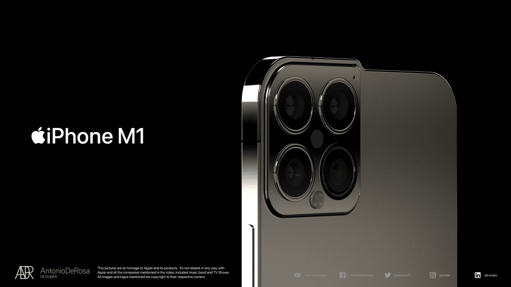
A new mockup has explored how the iPhone could look if the current bezels were moved.
Designer Antonio De Rosa has put together a stunning – albeit unusual – mock showing off an imagined iPhone, where the front-facing technology is placed above the display in an offset design.
The design allows the iPhone’s screen to be uninterrupted by notches or bezels for cameras and Face ID sensors, and rather than adding a large bezel at the top of the screen, the mockup shows off what a right-hand-side bezel could look like.
This is a radical design change and De Rosa has named the mockup the iPhone M1, imagining a world where the new Apple design language, as seen on the iPad Pro, iPhone 12, and iMac, could be better translated into the world’s most popular smartphone chassis.
It’s unlikely that Apple would ever adopt such a radical design change, but it’s interesting nonetheless and offers a ‘what if’ look at an alternative universe in Apple design.
Do you like this iPhone design? Let us know and check back soon for more mockups and concepts.
