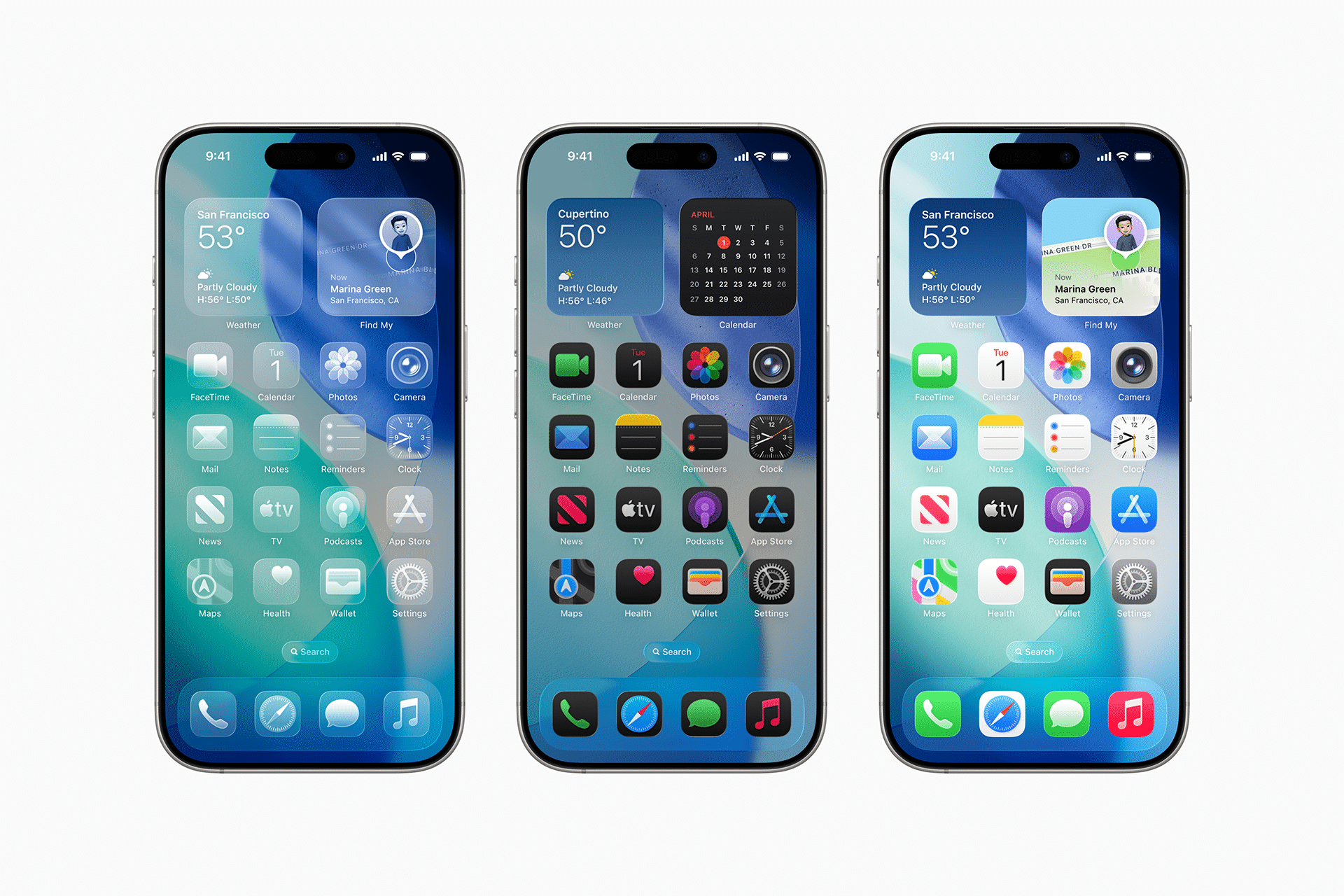
Liquid Glass represents Apple’s latest stab at elevating the home screen from flat tiles to something more tactile. Introduced with iOS 26, this aesthetic layers virtual glass effects over app icons, simulating light refraction and subtle shadows to mimic three-dimensional objects. The result? Icons that catch a faux glow, as if lit from within, adding a layer of sophistication to the interface.
Developers crafting icons for the App Store now have tools to fine-tune these effects, adjusting light sources and transparency levels through Apple’s Icon Composer. A virtual beam, often positioned from the top-left, casts highlights on one edge while deepening shadows on the opposite side. This creates a sense of volume, making icons pop against wallpapers. For most, it’s a refined touch that aligns with Apple’s history of blending form and function in display tech.
Yet the innovation comes with a catch. The dynamic lighting shifts as users tilt their iPhones, recalculating reflections in real time. On compatible devices running iOS 26, this kinetic response aims to make the screen feel alive, but it sets the stage for optical surprises.
The Tilted Icons Phenomenon Explained
At the heart of the complaints lies a simple yet stubborn illusion: app icons appearing slanted, as if the entire grid has warped. Users describe the effect as most pronounced in dark mode, where contrasts sharpen and shadows stretch. One Redditor captured the frustration bluntly, calling iOS dark mode “an optical nightmare.” For those affected, the perceived lean isn’t just distracting—it’s nauseating, with reports of dizziness kicking in after prolonged use.
This isn’t mass hysteria but a classic perceptual trap, akin to the Cafe Wall Illusion where parallel lines seem to bend due to alternating black-and-white patterns. Here, the interplay of light and dark patches on icons tricks the brain into seeing tilt. The virtual light source, fixed at angles like -45 degrees or -139 degrees in developer tests, illuminates edges unevenly—brightening the top-left while dimming the bottom-right. When combined with certain wallpapers or icon styles, like the Clear or Tinted appearances, the imbalance amplifies, making icons drift visually.
Not everyone falls victim. Sensitivity varies, much like how some spot hidden images in optical art while others see nothing. Factors such as screen brightness, viewing distance, and even individual visual processing play roles. The illusion thrives in low-light conditions, where the eye strains to parse depth cues that aren’t truly there.
Why This Hits Differently for Sensitive Users
For the unlucky few, the slant goes beyond annoyance, edging into physical discomfort. The original poster on Reddit detailed how the effect induced vertigo-like symptoms, forcing them to avert their gaze during routine checks of notifications or app launches. This echoes broader concerns in UI design, where motion and parallax effects—think of the subtle bounces in iOS animations—can trigger motion sickness in about 20% of users, according to human factors research.
Apple has long acknowledged such vulnerabilities, embedding accessibility options like Reduce Motion to flatten animations and curb queasiness. But Liquid Glass operates on a subtler plane: it’s static tilt, not overt movement, that fools the vestibular system, the inner ear’s balance keeper. When the brain reconciles conflicting signals—one from the eyes suggesting instability, the other from the body saying all is steady—the mismatch brews unease.
Visual experts liken it to forced perspective in photography, where lines converge to fake depth. In iOS 26, the glass layers exacerbate this by allowing “light” to pass through, hitting unexpected corners and creating asymmetrical glows. Custom icons, where developers tweak lighting independently, can worsen the skew if not calibrated carefully.
Design Choices and the Perils of Photorealism
Apple’s Icon Composer tool empowers creators with granular control, but that freedom invites inconsistency. Icons built with default glass overlays inherit the top-left lighting, which casts predictable shadows. Yet when paired with bold wallpapers—say, high-contrast gradients—the shadows bleed into the background, blurring boundaries and heightening the slant.
This push for realism traces back to Apple’s ceramic shield displays and oleophobic coatings, which already make screens feel premium. Liquid Glass extends that philosophy digitally, treating icons as frosted panes rather than mere symbols. The trade-off? A design that wows on spec sheets but falters for edge-case perceptions.
Critics in design circles point out that iOS has flirted with such effects before, from the watery lock screen in iOS 16 to depth-of-field blurs. Each iteration refines the tech, but human vision remains the wildcard. As one interface specialist noted in related forums, “What delights the majority can disorient the minority—balance is key.”
Navigating the Illusion: Options for Relief
Apple’s built-in tools offer partial solace. The Reduce Motion setting, found in Accessibility, dials back parallax and transparency effects, potentially straightening perceived tilts by simplifying the visual stack. Pairing it with Increased Contrast sharpens edges, reducing shadow ambiguity. For dark mode holdouts, switching to light mode mutes the drama, as softer tones dilute the light-dark contrasts fueling the illusion.
Third-party tweaks, like icon packs from the App Store, let users strip away glass effects altogether, opting for flat designs that sidestep the issue. Wallpapers matter too—neutral solids or patterns without strong lines minimize interference. If dizziness persists, a quick device restart or software update check can rule out rendering bugs, though no patch targets this specifically yet.
For developers, the lesson is clear: test icons under varied conditions, simulating user tilts and lighting. Apple’s guidelines urge harmony with system aesthetics, but enforcement is light, leaving room for outliers.
Broader Implications for iOS Interface Evolution
This episode underscores a tension in Apple’s design ethos: innovate boldly, but account for human frailty. As iOS 26 rolls out to millions, feedback loops like Reddit threads become vital sentinels, surfacing quirks before they snowball. While not a widespread crisis, the Liquid Glass glitch reminds that optical engineering—blending code with cognition—demands empathy.
Looking ahead, expect refinements in iOS 26.1 or beyond, perhaps with toggleable lighting angles or illusion-mitigating filters. It also spotlights accessibility’s growing role; what starts as a niche complaint often informs features benefiting all, from color-blind modes to haptic feedback. In a world of ever-slicker screens, keeping users grounded isn’t just polite—it’s essential to trust in the tech.