Apple’s interface design has never been static. From leather textures and stitched calendars to translucent layers and living surfaces, the evolution of iOS design reflects how Apple repeatedly reshaped not only its own software, but the entire technology industry. Liquid Glass in iOS 26 is not a sudden change — it is the result of nearly two decades of design decisions that started with skeuomorphism and slowly redefined how digital interfaces should feel.
Liquid Glass represents the culmination of Apple’s long-term design direction. It answers a question Apple has been refining since the original iPhone: how should digital interfaces feel when hardware, software, and human interaction are tightly integrated?
From Skeuomorphism to Flat Design
When the first iPhone launched, Apple leaned heavily on skeuomorphism. Notes looked like yellow legal pads. Calendars resembled stitched leather. Buttons appeared embossed and tactile. This approach helped users understand touch-based interfaces at a time when smartphones were new and unfamiliar.
Skeuomorphism wasn’t decorative for its own sake. It was educational. Apple used real-world metaphors to make digital interaction intuitive. As users became more comfortable with touch screens, those metaphors became less necessary.
The shift began quietly and accelerated with iOS 7. Apple removed textures, flattened icons, and embraced typography, color, and motion as primary design tools. The industry followed almost immediately. Flat design became the standard across Android, Windows, and web interfaces.


Depth, Motion, and Context
After flattening the interface, Apple reintroduced depth — but this time in a digital-native way. Blur, translucency, and layering replaced shadows and bevels. Control Center, notifications, and widgets began floating above content rather than sitting inside it.
Motion became structural rather than decorative. Parallax, zoom transitions, and physics-based scrolling helped users understand spatial relationships between elements. This design philosophy matured across iOS versions, laying the groundwork for what would eventually become Liquid Glass.
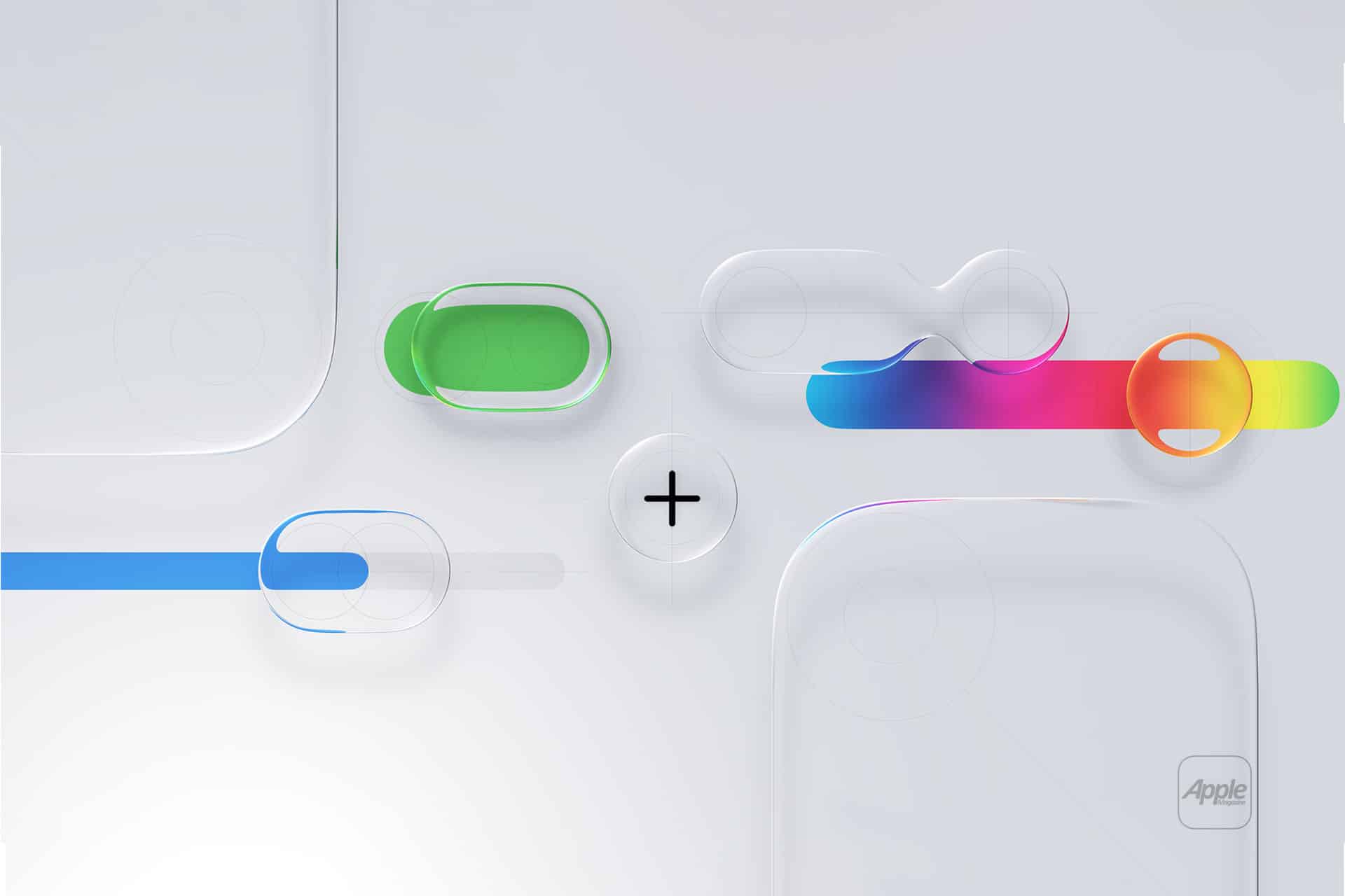
Liquid Glass builds on this foundation by treating interface elements as surfaces that interact with light, color, and content behind them. Instead of solid panels, UI components adapt dynamically to their surroundings.
What Liquid Glass Actually Changes
In iOS 26, Liquid Glass is most visible in system areas: Control Center, widgets, notifications, app chrome, and navigation layers. These elements no longer feel like overlays; they feel embedded in space.
Transparency is smarter. Colors sample from background content without sacrificing legibility. Blur is contextual rather than uniform. Edges feel softer, and layers respond subtly as content changes beneath them.
Unlike earlier transparency effects, Liquid Glass is designed to scale across brightness levels, wallpapers, and app contexts. It’s not about showing what’s behind — it’s about blending with it.
Why Apple Always Leads Interface Shifts
Apple’s design influence comes from control. By designing hardware, software, and core frameworks together, Apple can evolve interfaces without fragmentation. When Apple commits to a new design language, it appears consistently across devices and apps.
This consistency forces the industry to react. Developers adapt. Competitors imitate. Standards shift.
Skeuomorphism taught users touch. Flat design normalized minimalism. Depth and motion made interfaces feel spatial. Liquid Glass pushes interfaces toward material realism without returning to physical metaphors.
Apple doesn’t chase trends. It introduces them, refines them, and lets the ecosystem follow.
Why Liquid Glass Feels Inevitable
Liquid Glass isn’t flashy by default. It’s subtle, restrained, and deeply integrated. That’s intentional. Apple designs interfaces meant to disappear during use, not dominate attention.
This is also why Liquid Glass works best over time. As users interact with it daily, the interface feels calmer, more coherent, and less mechanical. The glass metaphor is not literal; it’s experiential.
By the time a design language reaches this stage, Apple rarely abandons it. Instead, it becomes the baseline for future refinement.
Liquid Glass as a Design Endpoint
Looking back, the journey from stitched leather to living glass feels logical. Apple removed physical metaphors once users no longer needed them. It then rebuilt a sense of depth and materiality using purely digital tools.
Liquid Glass is not the end of Apple’s design evolution, but it represents a mature state. It balances clarity, beauty, and function in a way that feels aligned with how people actually use their devices today.
As history has shown, when Apple settles on a design language at this level, the rest of the industry eventually adjusts around it.