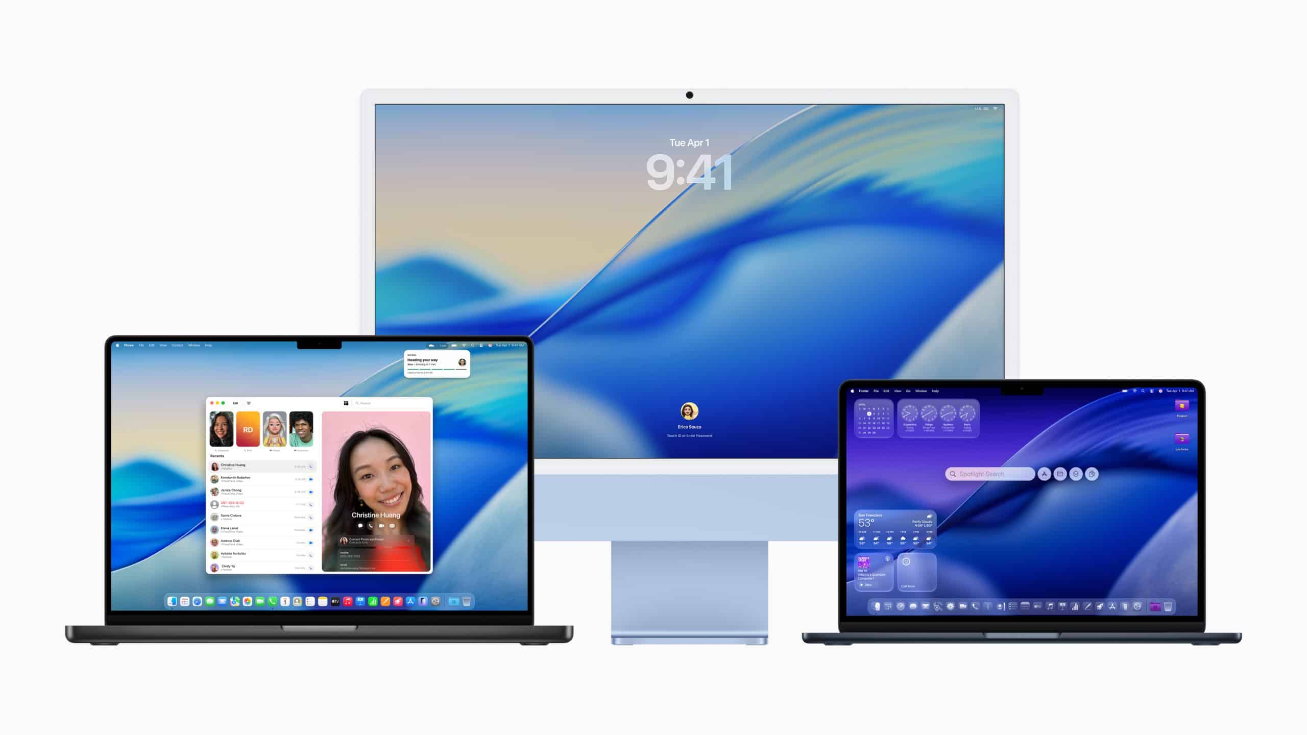
While the idea mirrors what already feels natural on iPhone, the Mac version lacks one crucial ingredient: motion. That absence makes Liquid Glass far less immersive on macOS, even when all visual settings are enabled.
Liquid Glass on the Mac adds transparency and layered surfaces across the system, but it stops short of delivering the dynamic feeling users associate with Apple’s most recent interface designs. You can enable it today, yet the experience feels static compared to iPhone, where motion and interaction complete the illusion of living glass.

How to Enable Liquid Glass on Mac
Liquid Glass is controlled through macOS appearance and accessibility settings. By enabling transparency and modern icon styles, you activate the visual layer Apple is refining. From there, you can adjust Light, Dark, Auto, and tint options to balance aesthetics with readability.
Workflow
- System Settings > Appearance > Allow Transparency
- System Settings > Appearance > Light / Dark / Auto
- System Settings > Appearance > Tint Icons
- System Settings > Accessibility > Display > Reduce Transparency (off)
macOS does not label this feature as “Liquid Glass,” but the effect emerges when transparency and modern visual styles are used together.

What Liquid Glass Is Meant to Do
Liquid Glass is designed to create the sense that interface elements float above content rather than sitting flat on top of it. Menus, sidebars, widgets, and Control Center panels gain depth through translucency, subtle blur, and layered color sampling from the background.
On iPhone, this works exceptionally well because the interface reacts to movement. As you tilt, swipe, and scroll, glass-like layers subtly shift, reinforcing the illusion of depth. Motion is not decoration there; it is structural to the design.
On the Mac, that same illusion is largely static.
The Missing Movement Problem
The biggest limitation of Liquid Glass on macOS is the absence of motion-driven effects. Menus do not respond dynamically to cursor movement. Panels do not subtly shift as windows move beneath them. Widgets remain visually frozen regardless of interaction.
Without motion, Liquid Glass becomes little more than transparency. The surface looks like glass, but it does not behave like glass. This makes the effect feel decorative rather than immersive.
This is especially noticeable on large displays, where the lack of parallax or reactive motion flattens the experience. What feels alive on iPhone feels painted on when transferred directly to the Mac.
Why It Feels Unfinished
macOS has to balance aesthetics with productivity. Apple has historically been conservative with animation on the Mac to avoid distracting users who spend hours in front of a screen. That caution is likely why Liquid Glass arrived without movement-based interaction.
However, the result is a visual system that feels incomplete. Transparency without motion reduces contrast while offering little experiential payoff. In certain lighting conditions or with detailed wallpapers, readability can suffer without the compensating benefit of depth perception.
This explains why Apple keeps strong fallback options in place, including opaque system elements and reduced transparency controls.
How to Make Liquid Glass Work Better Today
If you want to use Liquid Glass on macOS, small adjustments help offset its limitations. Choosing simple wallpapers with gradients or soft colors prevents visual noise behind translucent panels. Dark or Auto mode improves contrast, especially at night.
Tinted icons can add character without relying fully on transparency. For many users, a partial adoption of Liquid Glass elements results in a cleaner, more comfortable desktop than enabling everything at once.
Reducing transparency remains a valid choice for those who value clarity over aesthetics.
Why Apple Is Still Pushing This Direction
Despite its current shortcomings, Liquid Glass represents Apple’s long-term design direction. The company rarely abandons visual systems once introduced. Instead, they evolve quietly over several releases.
Dark Mode, widgets, and even Mission Control followed similar paths. Early versions felt limited or awkward. Later refinements made them feel inevitable.
Liquid Glass on macOS should be viewed the same way. What exists today establishes the foundation. Motion, smarter contrast handling, and deeper interaction are the logical next steps.
For now, Liquid Glass on the Mac is a visual preview rather than a finished experience. It shows where macOS is going, even if it hasn’t fully arrived yet.
