
MacBook Magic Island is the kind of idea that makes immediate sense because it answers a question Apple never fully solved on the Mac. Why is the notch there if it does almost nothing for the experience? Since Apple introduced the MacBook notch, most people have simply adjusted to it. Over time, it became part of the silhouette of the display, but it never became truly useful. It remained a compromise people tolerated rather than a feature people appreciated.
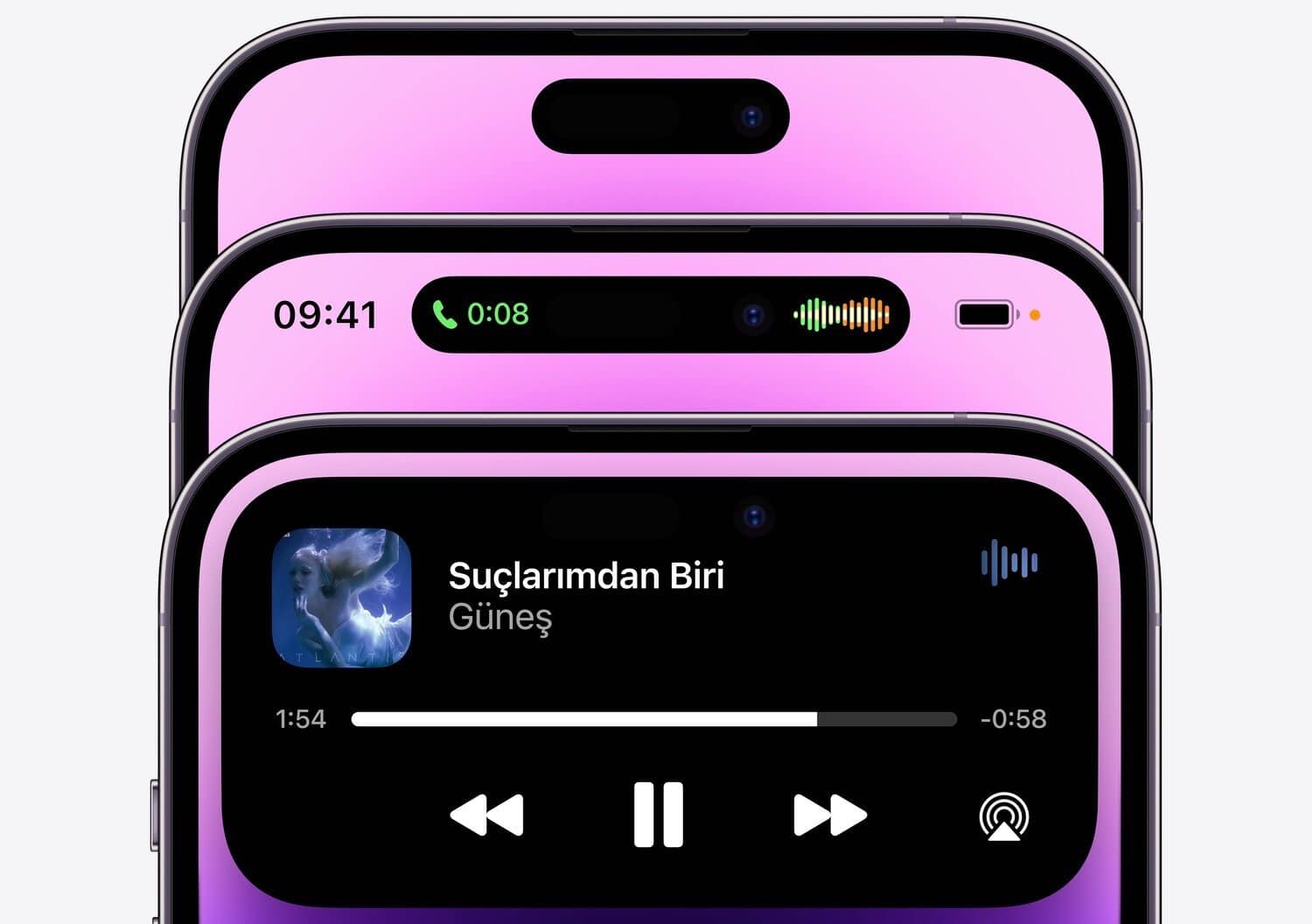
That is why the idea of MacBook Magic Island is so compelling. It offers Apple a simple way to turn a visual interruption into something helpful. On iPhone, Apple already proved it knows how to do this. A hardware cutout became a software feature that could show timers, calls, music, directions, and background activity in a way that felt clear and natural. If Apple brings a similar concept to the MacBook, the notch could finally stop being something users work around and start being something they benefit from every day.
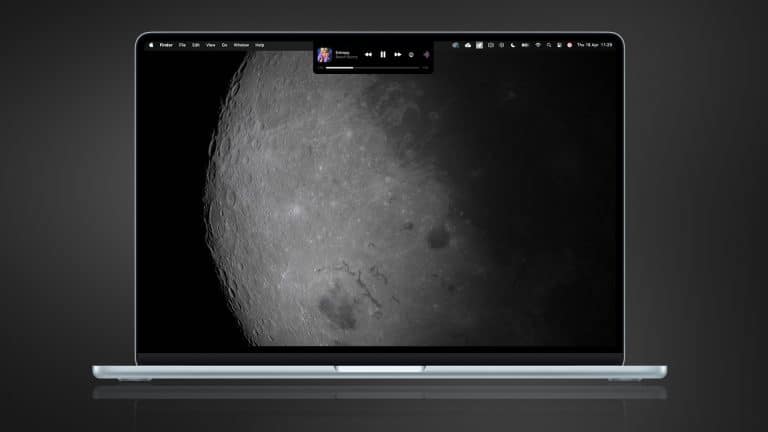
The Mac is actually a perfect place for this kind of change. A laptop spends long stretches open in front of the user. Notifications, progress indicators, calls, recordings, file transfers, audio playback, hotspot connections, and battery changes all happen while other work continues. Right now, that information is spread across the menu bar, Control Center, app windows, and notifications. A MacBook Magic Island could gather some of it into one elegant space, right where the eye already goes.

Why MacBook Magic Island Makes More Sense on a Laptop
A MacBook is built for longer sessions than an iPhone. That changes how a feature like this should work. On the phone, Dynamic Island helps people catch quick changes while they move through short interactions. On the Mac, a similar idea would need to be calmer, lighter, and more work-oriented. It would not need to animate constantly or demand attention. It would need to become a quiet layer of useful context that sits above the work without interrupting it.
That is exactly why the concept is promising. The Mac already carries a lot of status information in small pieces. A timer counts down in one corner. Audio plays from another app. A call arrives while documents are open. A file export runs in the background. A meeting reminder appears. AirPods connect. Screen recording starts. None of these things is large enough to deserve a full interruption, but all of them matter enough that people want to keep track of them.
A MacBook Magic Island could bring those moments together. Instead of forcing everything into tiny icons or floating alerts, Apple could let the top center of the screen become a cleaner place for live updates. That would make the notch useful without making the interface heavier. It would also help the menu bar breathe a little more, which matters because it already carries too much visual responsibility on many Macs.
How Apple Could Make the Notch Useful at Last
The best version of MacBook Magic Island would not copy the iPhone directly. The Mac deserves its own rhythm. This should be less playful and more practical. Music playback could appear there with simple controls. A FaceTime call could stay visible without crowding the top of an app window. AirDrop progress could appear there briefly, then disappear. Export progress in Final Cut Pro or file uploads in the background could live there in a cleaner, more centered way.
Calendar alerts could also benefit. Instead of a standard banner dropping into the screen and then vanishing, a more refined alert around the notch could remain visible for a moment in a way that feels better integrated into the system. The same could apply to Focus mode changes, voice memo recording, hotspot status, or battery information for connected accessories.
This is where Apple has a real opportunity. The notch already occupies the most important visual line on the screen. If the company keeps that hardware design in future MacBooks, then it should give that space a stronger role inside macOS. Otherwise, the notch remains a visual tax without a meaningful return.
A change like this would also fit Apple’s broader interface direction. Across its platforms, Apple has been moving toward more adaptive, more contextual software. Widgets became more useful. Apple Watch learned to surface changing information more intelligently. iPhone notifications and live activities became more dynamic. A MacBook Magic Island would follow that same path without forcing the Mac to become something it is not.

Why 2026 Would Be the Right Time
If Apple is preparing a MacBook redesign for 2026, it would be the ideal moment to rethink the notch. Hardware changes always create the best opening for software meaning. A new display design, slimmer borders, and a more refined macOS presentation would all make a feature like this more believable. Apple usually does its best interface work when hardware and software move together, and this idea depends on exactly that kind of coordination.
There is also a larger reason the timing works. The MacBook does not need a dramatic reinvention, but it does benefit from thoughtful improvements that make daily work smoother. A MacBook Magic Island could be one of those improvements. It would not need to change how people use a Mac. It would simply improve how the Mac communicates while people are already using it.
That is what makes the idea strong. It solves a problem that has existed in plain view ever since the notch arrived. Apple does not need to convince anyone the notch is beautiful. It only needs to make it valuable. If 2026 is the year Apple finally does that, MacBook Magic Island could become one of the smartest small changes the Mac has seen in years.