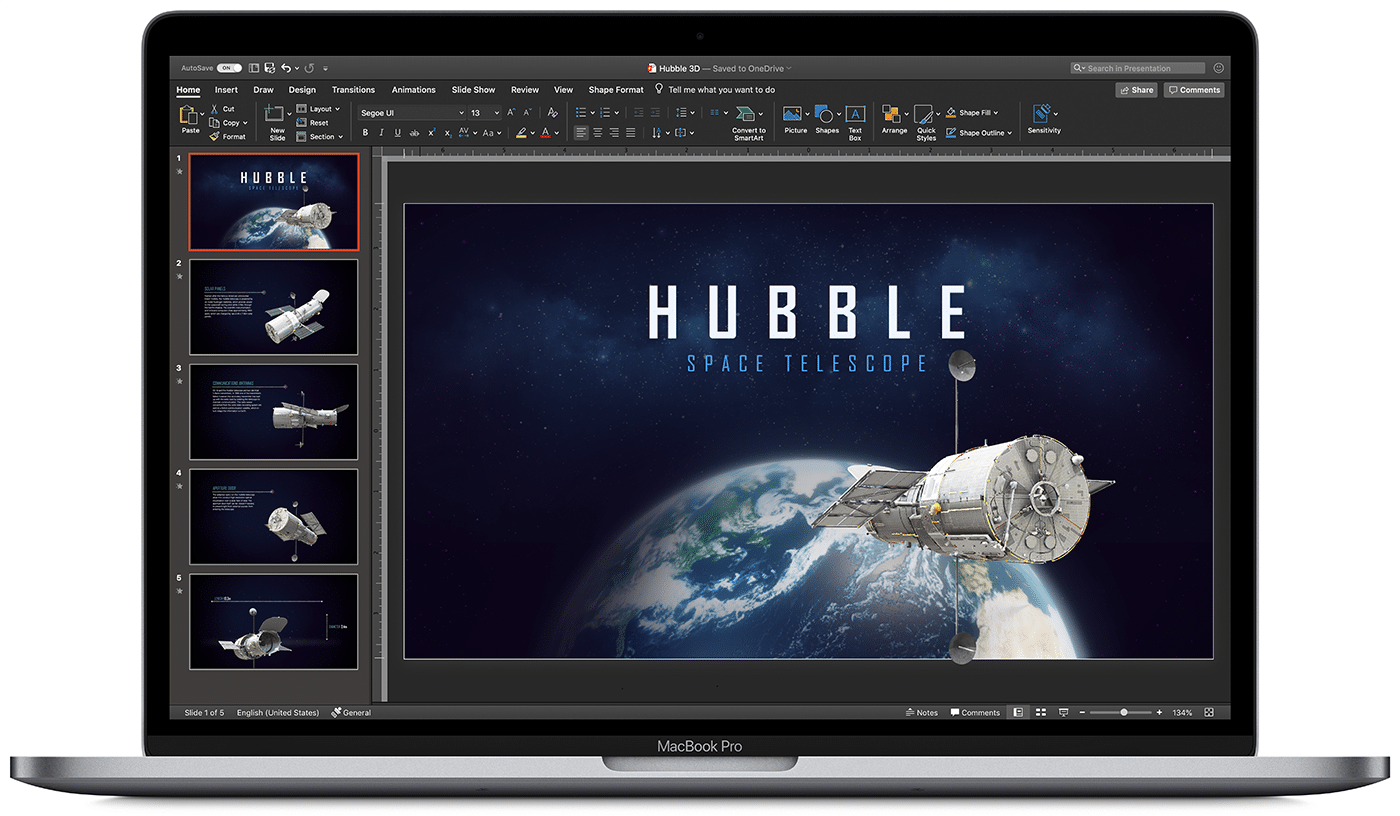
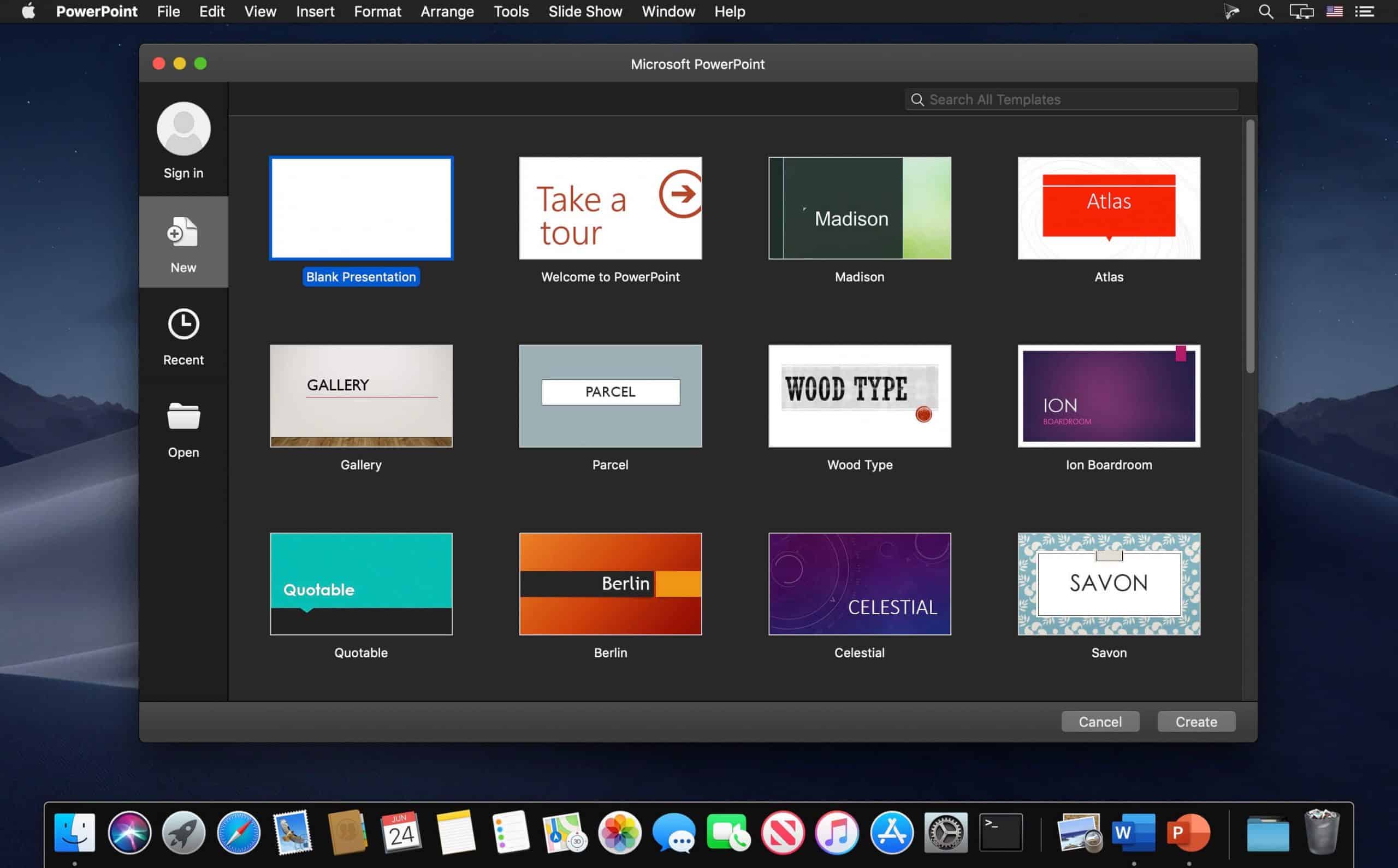
The maxim of “Death by PowerPoint” does not fit in today’s tech-savvy era. Numerous startups and corporates pitch their ideas to their clients through presentations every day. They leverage stunning templates to design them and sweep their stakeholders off their feet. Slideshows hold an enormous audio-visual appeal that helps you to hook your audience throughout.
Whether it is Keynote or PowerPoint, showcasing a slideshow on your Mac must appear seamless. Be it slide layout, design, visuals, or overall aesthetics, a collection of well-thought, pixel-perfect slides is the key to presentation success. So, how to craft splendid and eye-catching Mac presentations? This article will enlighten you perfectly. Let us begin!
Here are seven best tips for creating successful and compelling presentations on your Mac:
Minimalistic slides
Gone are the times when people assumed that designing a ppt meant overloading it with information. You’ll be doing your audience a huge favor if you opt for minimalism in your slide content. Often presenters overload the slides unnecessarily and thus, end up overwhelming the audience. Embed your decks with one topic per slide. Ensure that you build your pitch decks with less text and more graphics. Keeping the slide content simple and precise will bestow your MAC slideshow with a decluttered look. It will help you to further your brand aesthetics as well.
You may consider following the famous 10-20-30 rule of PowerPoint presentations. The rule states that your presentation should be no longer than ten slides. It must not take beyond 20 minutes to deliver the entire presentation. And at last, the slides should feature a font size of at least 30 px. The revolutionary 10-20-30 rule helps you keep your slides minimalistic, deliver a captivating presentation and engage with the audience like never before.
Engaging multimedia
Humans have a limited attention span. Keeping this in mind, you must always integrate enchanting visuals to liven up your presentation. Employ vector images, 1080p videos, infographics, and GIFs to render the slides attractive. The truth is, no one likes to read raw data right off the slides! As a presenter, you should consider transforming raw data into engaging visuals that bind the interest of the audience to the presentation.
The incorporation of audio and other media forms assists you with a seamless slideshow. You can infuse your slides with visuals corresponding to your presentation topic. It will work as a double-edged sword. First, it will garner your slides appealing. Second, it will reinforce the textual content in your audience’s minds as well. Hence, slides without dedicated multimedia contribute to the phenomenon ‘Death By PowerPoint’.

Top-notch templates
Breaking the monotony of stock templates in your Mac is essential to stay a step ahead of your competitors. Utilizing age-old templates will not impress your clients as effectively as you desire. There is a high chance that your audience is already familiar with the stock template from some other presentation. Hence, the wow factor goes for a toss!
Well, you can leverage ready-to-use PowerPoint templates from SlideModel that offer 100% customization, superior graphics, and pixel-perfect design. Users can utilize the avant-garde slide templates to boost their presentation goals. The goal here is to woo the audience with your presentations’ design! Gorgeous graphics and tailor-made slide content will save your precious time from making a presentation from scratch. This business Pitch Deck PowerPoint Template is a boon for all entrepreneurs to construct wow-worthy pitches.
Elegant color-palette
An excellent way to highlight the key points of your Mac slideshow is to create a color contrast on the slides. You can design your slides in relevance to your brand colors or choose a vibrant color scheme. A golden tip here is to blend your presentation with high-contrast colors. It will aid you and your audience in capturing the slide essence. Place the dark-toned text with a light-toned background and light-colored slide content on a dark background. It will bring out the effect of aesthetic contrast.
A great tip here is embedding your presentation with your brand colors for making it impressive beyond measure. Choose only two to three colors throughout to maintain an equilibrium. One should try not to use all the contrast colors to attract the audience. Design consistency in your slides is a key to presentation success. Rather than overwhelming the audience with different high-contrast, mismatching colors, try to include a couple of color schemes and palettes across your presentation.
Captivating data visuals
Whether you’re presenting to an assembly of investors, pitching to a client, or presenting a company’s quarterly results, always back your data with rich visuals. Rather than reading random numbers from the slides, you should introduce a wow factor to your slides by leveraging state-of-the-art data visualizations. Render your PowerPoint presentations on Mac an awe-inspiring look with data visuals such as 3D charts, diagrams, infographics & graphs.
Display your research and statistics with mind-blowing data visuals. Employ alluring charts, tables, diagrams, trend lines, shapes, and infographics. You can color-code them to show comparisons and differences. Choose data visuals for bullets to leave an indelible mark on your audience. Projecting data with these tools helps your clients to retain information and comprehend it as well. SlideModel offers innumerable templates with exemplary data visuals for influencing the audience.

Hierarchical structure
Many people do not know the fact that information displayed first captures the attention of your audience before others. Thus, visual hierarchy is a way to organize your slide content based on its importance. Every presentation is intended to initiate a call-to-action amidst the audience. Presenters can reinforce the critical subject content through rich hierarchical structures. Prioritize placing the slide content in a manner that you want your clients to see initially.
Recognize the slide elements in the order of their significance and place them accordingly. Use good contrast placements, bolder texts, and large visuals. This way, your stakeholders will view your highlighted information first and then move to the other content. Hence, with your presentations, be it remote or in-person, you can encourage your audience to close the deal with you rather than missing the opportunity.
Master the typography
Every slideshow looks tidy when crafted with good typography. Apply corporate-grade typography fonts such as Helvetica instead of unprofessional or artistic Comic Sans. It assists in keeping easy readability for your slide content, plus helps in boosting the integrity of the content. Remember to place the size of your fonts as 30 px or more for your audience in the back as well. You won’t want your audience to squint their eyes while seeing your ppt.

As a presenter, you should always take care of the content length. One should avoid typing hefty paragraphs. Instead, go for one-liners and bullets. You may use six bullet points in each slide. Another great tip is to position the title of your slide to a slightly bigger font than the text. While presenting, you can further elongate the one-liners and help your audience understand the crux of the subject matter without throwing them off the track.
Mac PowerPoint presentations having a beautiful style can result in having a colossal effect on your audience. A well-crafted PowerPoint presentation can be a deciding factor between a closed deal and a missed opportunity.
Keep these seven enlightening and professional tips in your mind before structuring your next ideal presentation. Integrate a pinch of style, creativity, and vigor in your slide deck to create modernistic slides. The key is to attract your audience with minimalistic, yet engaging slide content.


