
Studio Display color profiles are easy to overlook because Apple’s 27-inch 5K display is designed to look excellent out of the box. For many Mac users, the default Apple Display mode is enough. It delivers a bright, wide-color image suited for writing, browsing, office work, photo viewing, video calls, and general creative tasks. But Studio Display also includes several reference modes that make it more useful for people working across photography, web design, print, video, and color-sensitive production.
These modes are not filters. They change how the display represents color, white point, gamma, and brightness so the image better matches a specific standard. That is the difference between making a screen look pleasing and making a screen behave predictably. A designer preparing a website, a photographer editing portraits, and a video editor checking Rec. 709 footage do not always need the same target.
Apple lists Studio Display reference modes for Apple Display (P3-600 nits), HDTV Video (BT.709-BT.1886), NTSC Video, PAL and SECAM Video, Digital Cinema P3-DCI, Digital Cinema P3-D65, Design and Print (P3-D50), Photography (P3-D65), and Internet and Web (sRGB). Each has a different practical use.
For everyday work, Apple Display is the best starting point. For web previews, sRGB matters. For photography, P3-D65 can better match modern photo workflows. For print, P3-D50 supports a warmer white point closer to common print-viewing conditions. For broadcast and video, BT.709-BT.1886 helps editors evaluate footage in a more standard Rec. 709 environment.
The value is not that every user should switch modes constantly. The value is knowing which mode fits the job.
Studio Display Color Profiles for Everyday Mac Use
For most people, Apple Display (P3-600 nits) should remain the default. It uses the wide P3 color gamut and supports Studio Display’s 600-nit brightness, giving macOS the vivid but controlled look Apple expects across its apps. It is the right choice for Safari, Mail, Pages, Keynote, Photos browsing, Apple TV, music, school work, office tasks, and general productivity.
It is also useful for creators who are not delivering to strict color standards. If someone is editing social media images, preparing presentations, designing thumbnails, or working casually in Pixelmator Pro, Photoshop, Lightroom, Canva, Figma, or Final Cut Pro, Apple Display often gives the most comfortable daily result.
The mistake is using Apple Display as the final judge for every project. A wide-color display can make images look richer than they will appear on standard sRGB screens. That is not a problem for normal use, but it can mislead web designers, photographers, and editors who need to know how content will look on other devices.
This is where switching reference modes helps. A website should not be judged only in wide P3 if most viewers will see it through sRGB color management. A print layout should not be judged only under a bright, cool screen if the final output will be paper viewed under warmer light. A video mastered for SDR should not be checked only in a general-purpose display mode.
Apple Display is the comfort mode. Reference modes are the delivery modes.


When to Use sRGB, Photography, and Print Modes
Internet and Web (sRGB) is the safest mode for checking how images, graphics, and interface colors may appear across standard web environments. Designers working on websites, app mockups, newsletters, online ads, or e-commerce images should use it when the final audience is broad and not limited to wide-color Apple devices.
sRGB is also useful for quality control. A photo may look vibrant in P3, then feel flatter in sRGB. That does not mean the display is wrong. It means the destination is different. Checking both modes can help creators avoid oversaturated colors, weak contrast, or unexpected shifts after export.
Photography (P3-D65) fits modern photo editing, especially when working with wide-color images and Apple devices. It keeps a D65 white point, which aligns with many digital photo workflows. Photographers using Lightroom, Photoshop, Capture One, Photos, or Affinity Photo may prefer this mode when editing images intended for digital delivery, high-quality screens, or wide-color output.
Design and Print (P3-D50) is more specialized. The D50 white point is warmer and closer to print reference conditions. Designers preparing brochures, magazines, packaging, proofing files, or print layouts may use this mode when comparing screen color against print workflows. It is not a replacement for printer profiles or soft proofing, but it gives the display a more appropriate starting point.
Third-party software matters here. Photoshop, Lightroom, Capture One, Affinity Photo, and Adobe InDesign all depend on color-managed workflows. A Studio Display reference mode can set the screen target, but the app still needs the correct document profile, export profile, and soft-proof settings. The display mode is only one part of color accuracy.
Video Modes for Editors
Studio Display’s video reference modes are useful for editors who need to check footage against common standards. HDTV Video (BT.709-BT.1886) is the most relevant for many SDR video workflows. Rec. 709 remains central for television, YouTube SDR delivery, corporate video, education, and many online projects.
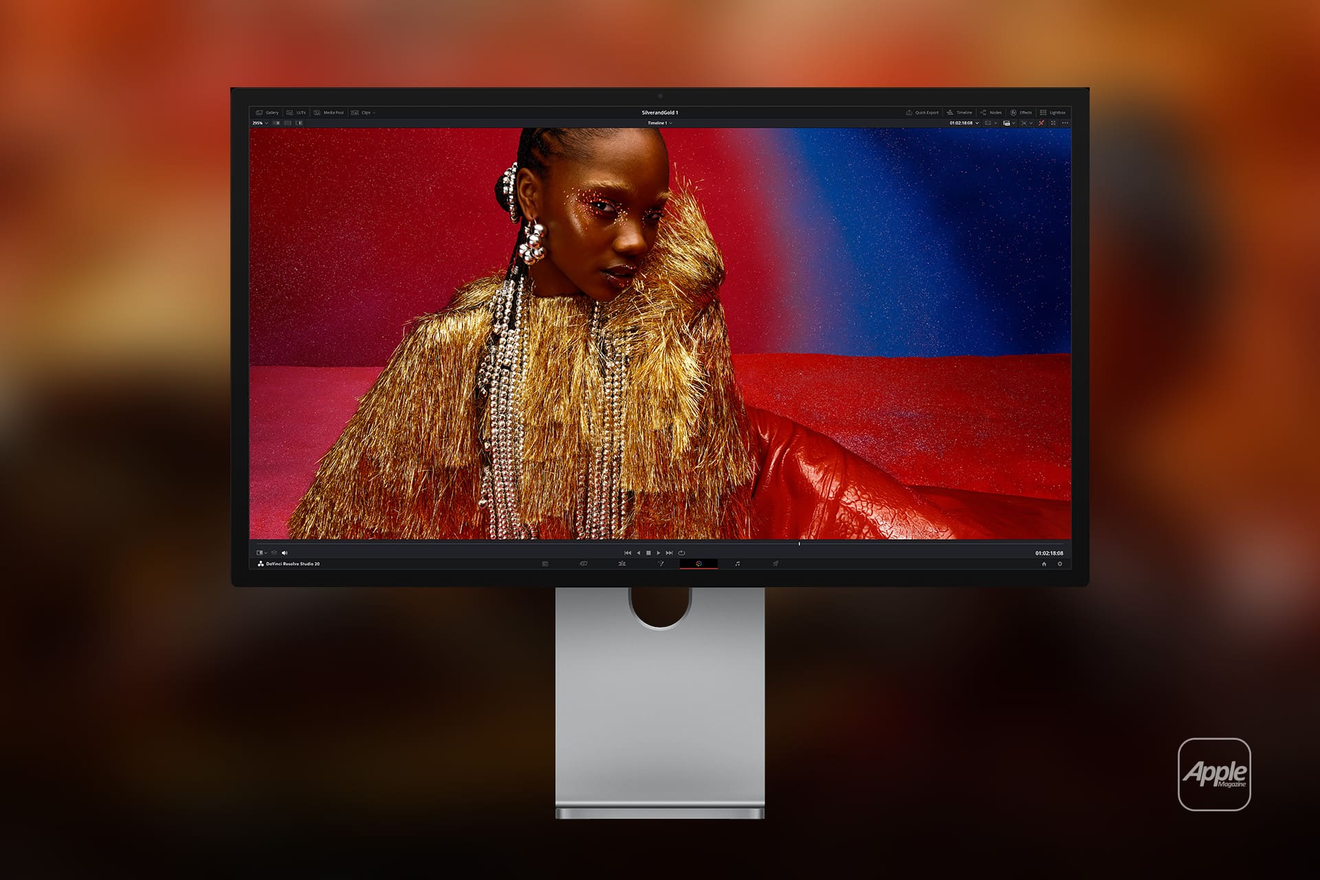
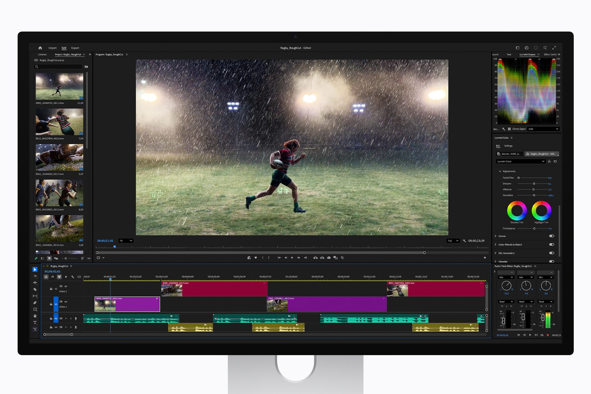
Editors using DaVinci Resolve, Final Cut Pro, Adobe Premiere Pro, or Avid Media Composer can use Studio Display as a practical Mac display for editing and review. DaVinci Resolve includes its own color management tools, including ACES support, and Adobe and Apple apps also provide project-level color controls. The Studio Display mode should match the timeline or delivery target as closely as possible.
Digital Cinema P3-DCI and P3-D65 are more specific. They are useful when checking content intended for cinema-style or P3 workflows. Most casual creators will not need them every day, but they matter for editors and colorists who work across different delivery formats.
Studio Display is not a full replacement for a dedicated reference monitor in high-end grading suites. It does not offer the same HDR performance as Apple’s XDR displays or specialized broadcast monitors, and it is limited to 600 nits. But for many Mac-based editors, its reference modes make it a more controlled display than a generic external monitor.
The practical habit is simple: edit comfortably, then check in the mode closest to the delivery target before export.
Third-Party Calibration and Software
Apple gives Studio Display factory calibration and built-in reference modes, but some workflows still benefit from third-party tools. Calman, DisplayCAL, and hardware colorimeters or spectroradiometers can help users measure a display, create ICC profiles, or verify whether the screen is still matching expectations.
Calman with Patterns for Mac is especially relevant for Apple display workflows because it can be used alongside Apple’s reference modes and fine-tune calibration processes. DisplayCAL is another option for users who want open-source ICC profiling built around ArgyllCMS, though setup and compatibility can be more technical.
The right tool depends on the job. A photographer preparing prints may use a colorimeter with DisplayCAL or a similar calibration workflow. A video professional may use Calman or another measurement system to verify Rec. 709 or P3 behavior. A designer may rely mainly on Apple’s built-in reference modes and color-managed apps, then test exports across devices.
Third-party creative software also has its own color settings. DaVinci Resolve color management, Photoshop soft proofing, Lightroom export profiles, Premiere Pro sequence settings, and Figma’s browser-based previews can all affect results. Changing the Studio Display mode without checking app-level color settings can create confusion.
The best workflow is coordinated: display mode, app color settings, file profile, export target, and final device should all match the intended output.
A Practical Way to Choose Modes
Most Studio Display owners do not need to use every reference mode. A simpler approach works better.
Use Apple Display for daily Mac work and general creative editing. Use Internet and Web (sRGB) when checking websites, app interfaces, online graphics, and broad consumer delivery. Use Photography (P3-D65) when editing wide-color photos for digital display. Use Design and Print (P3-D50) when preparing print work or comparing layouts to proofing conditions. Use HDTV Video (BT.709-BT.1886) when finishing SDR video. Use Digital Cinema modes only when the project requires P3 cinema-style targets.
True Tone and Night Shift should also be considered. They can make the display more comfortable for casual use, but they are not ideal for color-critical work because they change the perceived white point. For accurate editing, keep the environment controlled, avoid strong colored lighting, and use the right reference mode instead of judging color in changing room conditions.
Studio Display’s color profiles are most useful when treated as workflow tools, not visual preferences. They help a Mac user answer a practical question: where will this work be seen, printed, streamed, or delivered? Once that answer is clear, the right mode becomes much easier to choose.