
True Tone is one of Apple’s most misunderstood display features because it can make a screen look more natural while also making it less reliable for strict color judgment. For everyday use, it is one of the reasons iPhone, iPad, Mac, Studio Display, and Pro Display XDR can feel comfortable in different rooms. For professional work, it becomes a setting that needs to be controlled carefully.
Apple designed True Tone to adjust the color and intensity of a display so it matches ambient light. In a warm room, the screen can become warmer. In cooler daylight, it can shift cooler. The goal is not to make the display more technically neutral. The goal is to make white areas feel more natural to the eye in the environment where the device is being used.
That distinction matters. True Tone is excellent for reading, writing, browsing, watching casual video, working in mixed lighting, and reducing the harsh feeling of a fixed white point in a warm room. But when the job is color fidelity, photo editing, video grading, product design, print previewing, or comparing tones across devices, True Tone can become a problem because it changes the display’s white point based on the room.
True Tone and Color Fidelity
True Tone improves visual comfort by responding to ambient light, but color fidelity depends on consistency. A designer, photographer, editor, or colorist needs the display to stay predictable. If the screen shifts warmer or cooler because the room light changes, the user may make color decisions based on the environment rather than the file itself.
That is why True Tone should usually be turned off for color-critical work. If someone is correcting skin tone, matching brand colors, grading video, preparing product images, checking white balance, editing RAW photos, or comparing a layout to a printed reference, the display should remain stable. A consistent white point is more important than comfort in that moment.
On Mac:
System Settings > Displays > True Tone
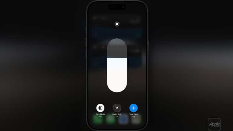
To turn True Tone on or off on iPhone or iPad:
Settings > Display & Brightness > True Tone
The setting is not good or bad by itself. It depends on the task. True Tone is helpful when the user wants the display to blend with the environment. It is less helpful when the user needs the display to behave like a fixed reference.
This is the main rule: use True Tone for comfort, turn it off for precision.

The Tech Behind True Tone
True Tone uses ambient light sensors to measure the light around the device and adjust the display’s color temperature and intensity. The feature tries to make on-screen whites appear more like paper would look in the same room.
That is why the screen may look warmer under indoor lighting and cooler under daylight. Apple is not randomly tinting the display. It is adapting the display to the surrounding light so the screen feels less visually disconnected from the room.
On iPhone and iPad, the adjustment happens through built-in sensors. On supported Macs and Apple displays, True Tone works with compatible hardware and ambient light sensors. Apple says Studio Display, Pro Display XDR, and supported Apple displays can use built-in ambient light sensors for True Tone when connected to a supported Mac.
This is also why lighting changes can affect the screen. If the user moves from a daylight window to a warm lamp, the display can shift. If the desk light changes during editing, the screen can shift. For general use, that adaptation feels pleasant. For color work, it adds a moving variable.
True Tone is different from Night Shift. Night Shift intentionally shifts the display warmer during evening hours to reduce blue light exposure. True Tone responds to ambient light throughout the day. Both affect color appearance, and both should generally be off for professional color work.
To check Night Shift:
Settings > Display & Brightness > Night Shift
On Mac:
System Settings > Displays > Night Shift
When to Keep True Tone On
True Tone is useful for most everyday Apple device use. It can make reading long articles, writing documents, browsing Safari, answering email, using Notes, checking Calendar, and working in mixed indoor light feel easier on the eyes. The display can feel less cold at night and less artificial in warm rooms.
It is also good for casual photo viewing. Looking through family photos, reviewing screenshots, scrolling social apps, watching videos, or using iPad as a reading device does not usually require a fixed white point. In those situations, comfort matters more than exact color.
True Tone can also make iPhone and iPad feel more consistent with physical surroundings. A white webpage in a warm room can look too blue when True Tone is off. With True Tone on, the display may feel closer to paper or a printed page.
This is the strongest consumer argument for the feature. It makes screens feel less like glowing panels and more like objects in the room.
When to Turn True Tone Off
True Tone should be turned off when the user is making decisions that depend on accurate color. This includes photo editing, video color grading, product photography, graphic design, web design, brand color review, print work, UI design, animation, color matching, and any task where the final result will be judged on another display or in print.
A photographer editing skin tones should not have the display warming and cooling as the room changes. A designer checking a brand’s blue should not let ambient light influence whether the color looks too purple or too green. A video editor reviewing white balance should not let the display compensate for the lamp on the desk.
For this work, the environment matters too. Turning off True Tone is only one step. The room should have stable lighting, reduced glare, and no strong colored light hitting the screen. A calibrated display or reference mode should be used when available.
A clean professional setup starts with:
True Tone Off, Night Shift Off, Auto-Brightness Off Where Needed, Stable Room Lighting
On iPhone or iPad, Auto-Brightness can be adjusted through Accessibility settings, though most users should leave it on for general use. For color checks, brightness should be set intentionally.
To find Auto-Brightness:
Settings > Accessibility > Display & Text Size > Auto-Brightness


Apple Displays and Reference Modes
Apple’s professional display story goes beyond True Tone. Studio Display, Pro Display XDR, and compatible Apple displays include presets or reference modes designed to match production requirements for HDR, HD, SD video, photography, design, and other media workflows.
Reference modes matter because they set display behavior around standards such as color space, white point, gamma, and brightness. That is the opposite of True Tone’s adaptive comfort approach. Reference mode is about consistency.
On supported Mac displays:
System Settings > Displays > Preset or Reference Mode
Apple says reference modes can match production requirements for HDR, HD, SD video, and other media types. This is the setting professionals should understand before relying on a display for final decisions.
For general office work, True Tone on a Studio Display can be pleasant. For editing, grading, or proofing, True Tone should usually be off and the correct reference mode should be chosen. A designer working in P3, a video editor checking Rec. 709, or a colorist reviewing HDR needs the display locked to the right target, not adapting to the room.
Studio Display is excellent for many creative workflows, but Pro Display XDR and newer high-end Apple displays are stronger choices for serious HDR and reference work. The user’s display choice should match the level of precision required.
iPad as a Monitor and Reference Tool
iPad can become part of a Mac workflow through Sidecar, letting the iPad work as a second display. That is useful for timelines, palettes, notes, previews, reference images, writing, and light editing. But color accuracy depends on the iPad model, display settings, and whether the workflow needs reference-level precision.
To use iPad as a second display:
System Settings > Displays > Add Display > Choose iPad
For supported iPad Pro models, Apple offers Reference Mode. Apple says Reference Mode can be used on iPad Pro for color workflows, and when using Sidecar with a Mac with Apple silicon, iPad Pro can act as a secondary reference monitor for supported standards.
To turn on Reference Mode on iPad Pro:
Settings > Display & Brightness > Advanced > Reference Mode
This is important because iPad as a monitor can mean two very different things. A regular iPad used through Sidecar is excellent as an extra workspace. An iPad Pro with Reference Mode can become more useful for color-aware workflows. Neither should be assumed accurate if True Tone, Night Shift, changing brightness, or unstable lighting is affecting the image.
For practical professional use, iPad is often best as a secondary reference or review display, not the only place where final color decisions are made. It can be helpful for checking how images feel on a high-quality Apple screen, previewing layouts, reviewing photos, or keeping a reference image nearby while the main calibrated display handles final work.
True Tone on iPhone for Color Checks
iPhone is one of the most common screens where people will see photos, videos, websites, and social posts. That makes it useful as a final consumer preview device. But it should not be treated as a color reference unless the settings are controlled.
For casual viewing, True Tone can stay on. For checking a photo, product image, website color, or video before publishing, True Tone should be turned off. Night Shift should also be off, brightness should be stable, and the screen should be viewed away from strong colored lighting.
A simple iPhone color-check setup:
- Settings > Display & Brightness > True Tone > Off
- Settings > Display & Brightness > Night Shift > Off
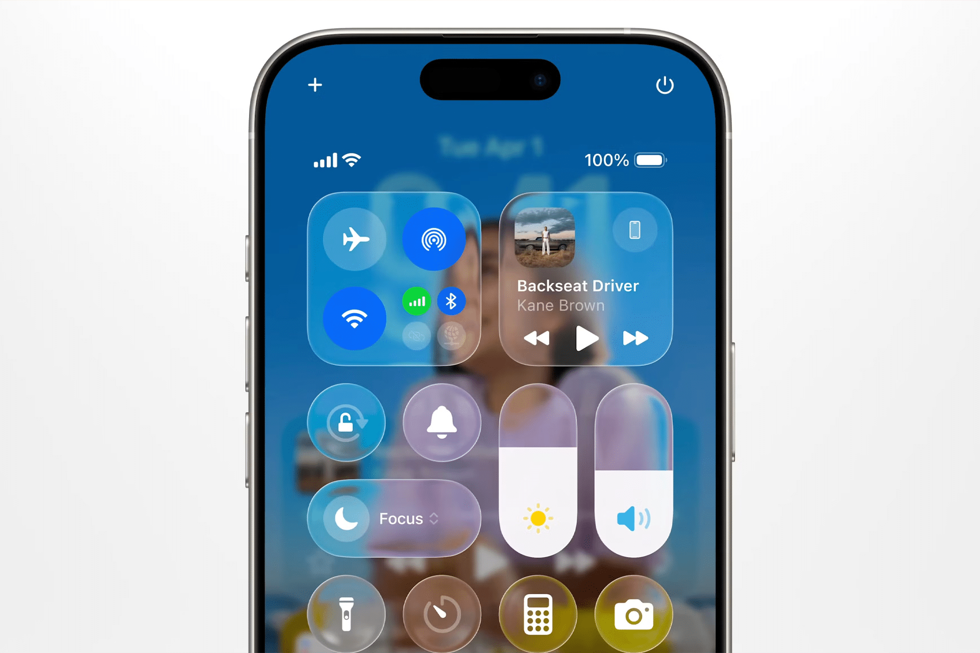
- Control Center > Brightness > Set Manually
This does not turn iPhone into a professional reference monitor, but it makes the check more consistent. It helps users see the image without Apple’s ambient-light adaptation changing the white point.
This is useful for social media creators, product sellers, photographers, designers, editors, and anyone publishing visuals that will be viewed mostly on phones. The iPhone is not the final truth, but it is an important real-world screen.
Practical Pro Cases
A photographer editing portraits on a Mac with Studio Display should turn True Tone off, choose a suitable display preset, keep lighting stable, and avoid strong warm lamps near the screen. After editing, the image can be checked on iPhone with True Tone off, then viewed casually with True Tone on to see how it feels in normal use.
A video editor working in Rec. 709 should use the correct reference mode on a supported Apple display and keep True Tone and Night Shift off. The goal is to see the footage against the intended standard, not against the room’s changing light.
A designer working on brand colors should turn True Tone off on Mac, iPad, and iPhone when comparing colors. If the same logo looks different across devices, True Tone may be one of the reasons. It should be removed from the comparison before judging the file.
A web publisher checking an article layout can use True Tone on for writing and browsing, then turn it off briefly to review images, gradients, product colors, and embedded graphics. This avoids working all day in a sterile display mode while still preserving accuracy when it matters.
A creator using iPad as a Sidecar display can keep research, notes, or controls on the iPad while the main Mac display handles color work. If using a compatible iPad Pro with Reference Mode, the iPad can become a more serious review screen, but True Tone should still be managed intentionally.
The Right Way to Think About True Tone
True Tone is not a professional calibration feature. It is a comfort and visual adaptation feature. It makes Apple displays feel better in changing environments by adjusting the screen to match the room. That is valuable for daily use and one of the reasons Apple devices feel polished.
Color fidelity requires the opposite behavior. It needs the display to stay stable, predictable, and matched to a known target. That means turning True Tone off, turning Night Shift off, choosing the correct display preset or reference mode, controlling brightness, and working under consistent lighting.
The best workflow is not to leave True Tone permanently on or permanently off for every situation. The best workflow is to use it intentionally. Turn it on when comfort and natural viewing matter. Turn it off when color decisions matter.
That makes True Tone one of Apple’s most useful display features, but also one of the easiest to misuse. It helps the screen feel right to the eye. It does not guarantee that the color is right for the work.