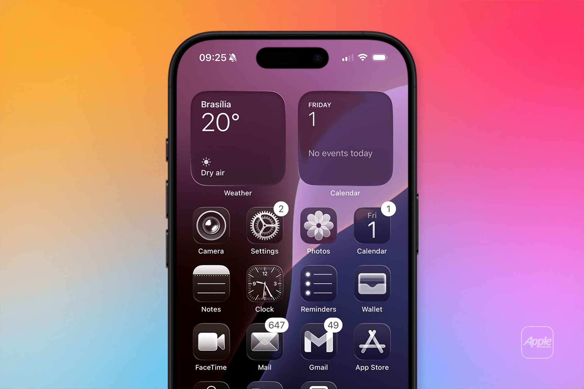
For the first time in over a decade, Apple has redrawn all system app icons, infusing them with a layered, glass-like appearance that emphasizes clarity and focus. Unlike previous versions, where iOS icons leaned on flat designs and macOS icons used 3D effects, iOS 26 ensures consistency across platforms. The new icons feature refined gradients and subtle shadows, making them appear as if crafted from multiple glass layers. For example, the Photos app icon now sports a vibrant, translucent flower motif, while the Camera app icon has shed its stark black bezel for a cleaner, sensor-focused look. These changes aim to make the Home Screen feel fresh yet familiar, enhancing visual appeal without disrupting usability.
Customization Options Enhance User Control
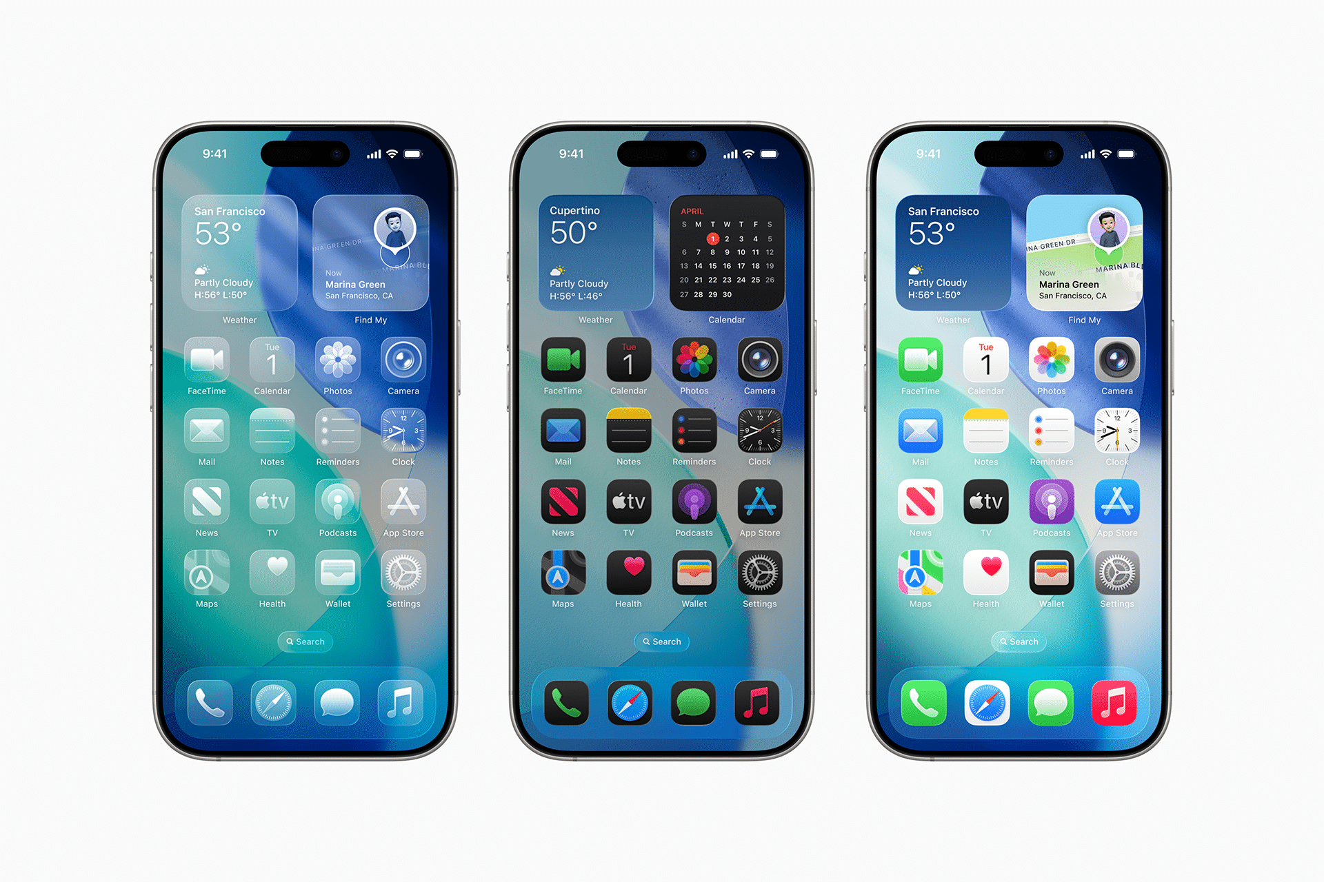
iOS 26 introduces unprecedented customization options, allowing users to tailor their Home Screen like never before. The new “Clear Icons” feature renders app icons nearly invisible, displaying only their outlines for a minimalist look, accessible via Settings > Home Screen > Edit > Customize > Clear Icons. Users can also apply light or dark mode tinting, with a new auto-switching option that adapts to ambient lighting. Dynamic wallpapers, introduced in beta 4, shift colors based on the time of day, complementing the Liquid Glass aesthetic. These features, combined with the ability to set custom backgrounds for Messages chats, give users greater creative control over their iPhone’s appearance.
Subtle Refinements Through Beta Testing
The iOS 26 beta process has revealed Apple’s iterative approach to perfecting the Liquid Glass design. Beta 3 introduced more opaque tab bars, but feedback prompted a return to greater transparency in beta 4, particularly in apps like Music and Safari. The Camera app icon saw a refined design with less inset bezel, while the Mail and Photos icons received subtle color tweaks for better contrast. Posts on X reflect mixed sentiment, with some users praising the glassy aesthetic and others finding certain icons, like those in folders, less polished. These adjustments highlight Apple’s responsiveness to user feedback, ensuring the final release balances innovation with practicality.
Impact on User Experience
The Liquid Glass redesign extends beyond aesthetics, influencing how users interact with their iPhones. The translucent icons and fluid animations make scrolling and navigation more engaging, with tab bars shrinking to prioritize content and expanding for quick access. The Lock Screen now supports spatial scene wallpapers, adding a 3D effect to photos that enhances immersion. For developers, the unified icon set simplifies app design across Apple’s platforms, potentially streamlining app development. However, the design’s reliance on transparency may pose accessibility challenges for some users, which Apple is addressing with high-contrast mode enhancements.
A Foundation for Future Innovation
The iOS 26 icon redesign sets the stage for a decade of visual evolution, as Apple describes Liquid Glass as the foundation for future iOS updates. With the public beta now available and a full release expected in September alongside the iPhone 17, users can explore these changes firsthand. The redesign not only refreshes the iPhone’s look but also signals Apple’s commitment to integrating its platforms under a cohesive aesthetic. As the company prepares for foldable iPhones and other innovations in 2026, iOS 26’s bold visual shift positions it as a pivotal step in redefining the iPhone experience.