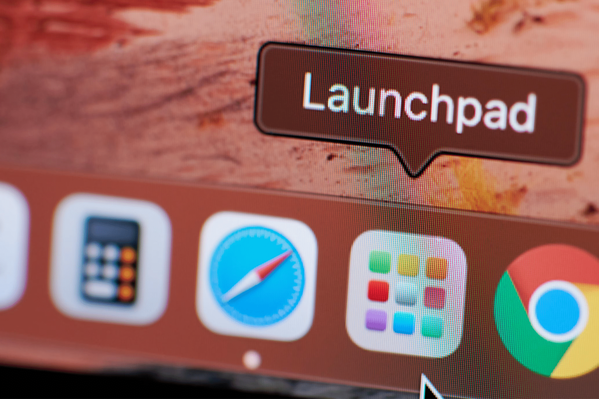
The removal of Launchpad, the full-screen app launcher introduced in 2011, has left a gap in the daily workflows of millions. Its replacement, simply called Apps, is functional but rigid, and for those who relied on Launchpad’s intuitive visual grid, the change feels less like progress and more like a setback.
Launchpad debuted with OS X Lion, borrowing from the iPad’s home screen to bring order and visual familiarity to macOS. For over a decade, it offered a full-screen grid of apps that could be organized into folders, rearranged across pages, and accessed with gestures or hot corners. It wasn’t flashy, but it became second nature for many who preferred visual discovery over typing app names. With Tahoe, Launchpad has been retired. The new Apps hub now occupies its slot in the Dock, offering alphabetical and Apple-defined category views, alongside algorithmic suggestions.
Why the New Apps Hub Falls Short
The problem isn’t that Apps doesn’t work—it’s that it strips away flexibility. Users can no longer create their own folders, drag icons freely, or arrange apps into layouts that matched their memory and preferences. Instead, the system enforces order: alphabetical lists, static categories, and suggestions that often fail to reflect real habits. For some, this new approach feels sterile, a one-size-fits-all solution in a platform celebrated for personalization. More importantly, gestures and hot corners that once pulled up Launchpad now open a rigid window, breaking years of muscle memory in the process.
Apple’s Push Toward Spotlight
Apple’s reasoning isn’t hard to guess. The company has been pushing Spotlight as the central way to find and launch apps, documents, and system settings. In macOS Tahoe, Spotlight is faster and smarter than ever, surfacing results instantly. But Apple’s assumption that everyone prefers typing over browsing overlooks the millions of users who navigate visually. Launchpad wasn’t just about finding an app; it was about the comfort of seeing everything at once, of arranging tools into a personal order that made sense at a glance. Apps, by contrast, feels more like a database than a desktop.
A Step Backward in User Experience
The frustration is less about nostalgia and more about workflow. Power users who organize dozens of applications into Launchpad folders now face a flat, restrictive interface. New Mac users, accustomed to iOS-style home screens, find Apps oddly less flexible than the very devices it was inspired by. Apple often justifies design changes as simplification, but in this case, simplification has come at the cost of choice. Even the keynote image for macOS Tahoe—an Apple logo rendered in glowing thermal textures—felt like an ironic hint at the new performance-driven philosophy: clean lines, but at the risk of burning away beloved details.
What Apple Could Do Next
There’s still room for Apple to fix this. Bringing back Launchpad as an optional mode would instantly win back goodwill. Allowing users to create custom folders or rearrange icons inside Apps could also strike a balance between order and personalization. Even simple gestures to toggle between grid and list views would restore some of the familiarity users crave. Apple prides itself on listening to its community—this is a moment to prove it.
Progress or Regression?
macOS Tahoe introduces bold visual changes and performance improvements that move the Mac forward. But the disappearance of Launchpad has left a void that its new Apps hub fails to fill. For those who valued the balance of power and personalization, the change feels like a regression disguised as refinement. The question isn’t whether Apps works—it does—but whether Apple should dictate how every user interacts with their Mac. For now, many are left asking a simple question: bring my Launchpad back.