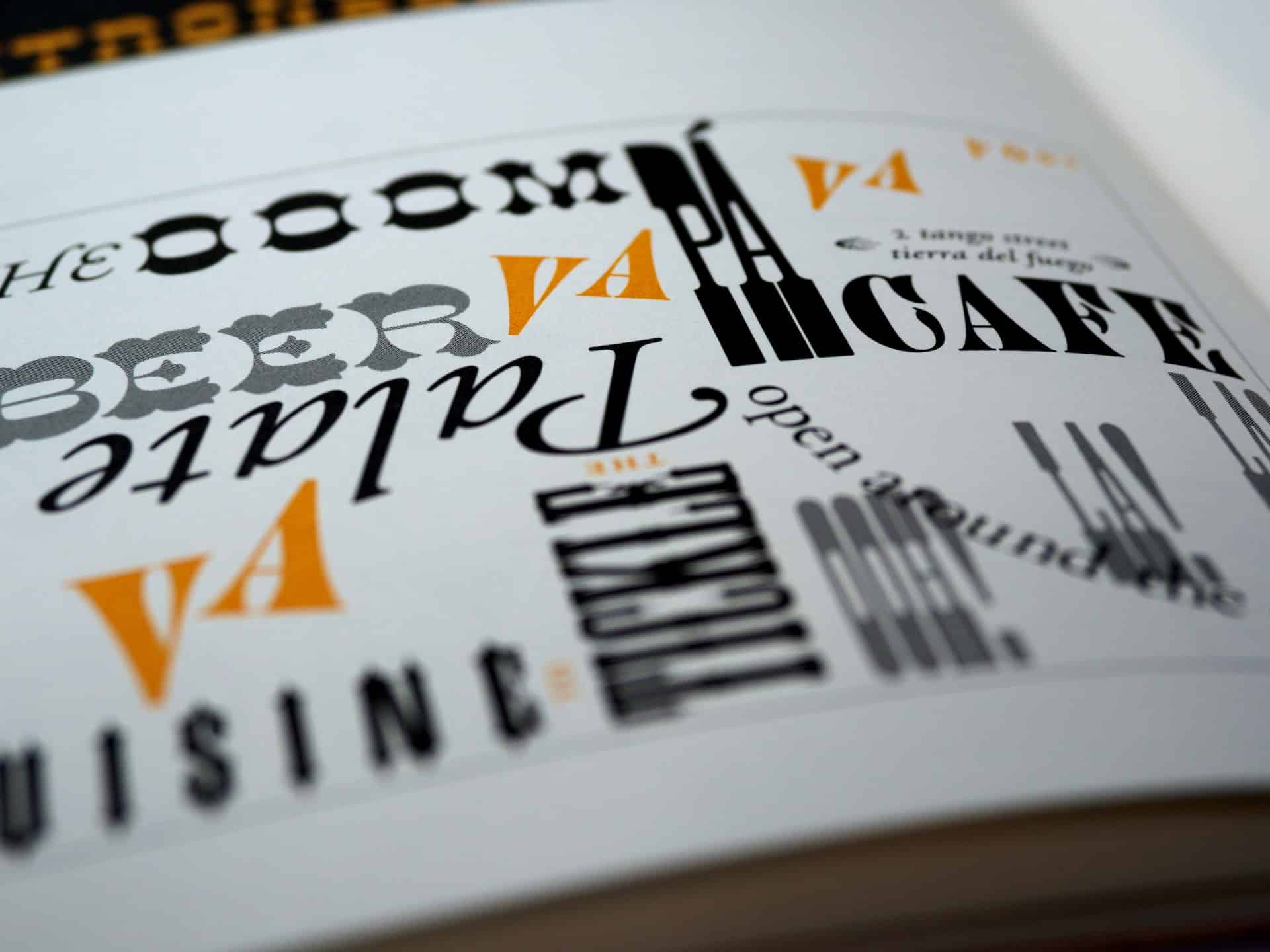
The right font will make a huge difference in how your content is perceived by your target audience. Fonts play a part in creating a consistent brand image, thereby making your content easy to read, while also adding a visual charm to your content.
Regardless, there are so many fonts to choose from and it can be overwhelming knowing where to start. Ranging from picking a good option for your brand to applying fancy alternatives on social media posts.
The following tips will be effective in making your content both attractive and influential in promoting your brand and making sure it reaches a wider audience.
Consistency
Your brand should have a consistent look and feel across all of your marketing materials, including the fonts you use.
Choosing an option that represents your brand lets you consistently use it across all of your content. This will make it easy for your audience to identify your brand and create a sense of familiarity.
It’s also important to make sure that the chosen font is understandable, easy on the eyes, and easily read on any device.
Use legible fonts
Some fonts are more legible when compared to others, but it’s also important to test different alternatives and pick the best for your audience.
Your content should be understood easily and quickly, using a legible text is not only important for readability but also in making sure that the content can be read by people with visual impairments.
It’s also important to make sure that the font you choose is not too small or too light as it can be difficult to read on small screens such as smartphones and smartwatches.

Social media
Using special fonts on social media can help your posts stand out and grab the attention of your audience. Here are a few tips for social media promotions:
- Use a font generator: Use text in your social media posts by finding an online font generator to create unique and attention-grabbing text;
- Text sparingly: While text can add visual interest, long texts can make your posts hard to read. Use text sparingly to add emphasis to specific words or phrases;
- Choose legibly: The most important thing is that your text should be legible;
- Combine with design elements: Combining illustration and graphics can create a more visually interesting and engaging post;
Sizes & styles
Different font sizes and styles can create different moods and emphasize different parts of your content.
Use larger font sizes for headlines and smaller font sizes for body text. Experiment with bold, italic, and underlined text to add emphasis.

Optimize for readability
With the increasing use of mobile devices, it’s important to optimize your content for readability on different screens. Test it on different devices and ensure that they are legible and easy to read on all screens.


